Individual Colors
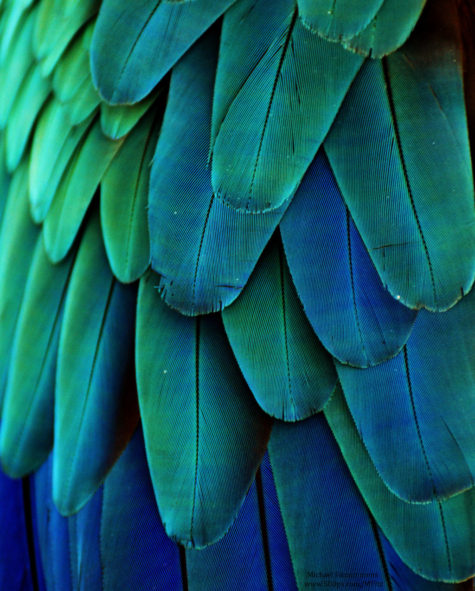
New Age Turquoise
- Key words: Love, healing, generosity, emotion, feeling , the unconscious , intuition, individual responsibility .creativity , communication, self reliance , independence.
This color has more to do with feeling and creative expression than with rational thought. These colors between green and blue the shades of turquoise, blue green and or aqua relate to transformation, evolution, change, sharing, waves, metamorphosis, transmutation, the inner teacher, and the spiritual heart or Thymus Chakra, a transpersonal chakra on the hara line (deeper aura level ) about midway between the heart and the throat.
This is a chakra which connects us with energies of spiritual love and mystical communion and the Divine or God concept (however you name it ) as teacher and as Sacred Lover and beloved. These are shades that admit us to varied realms of the trans-dimensional, meaning existence beyond time and space.
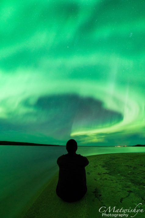
While the most common elemental attribution of this color is to water it is also a color of air and spirit. Turquoise is associated with ancient civilizations, the New Age and also with the zodiac sign of Aquarius. The word aqua means water. These shades are strongly evocative of the ocean on a clear day especially that of the lovely warm tropical Island seas.
This family of colors is a color of mystics and telepathy a symbol of the heavens and of the sea, of fluid movement and mutability.
These colors are used in color meditations, in forming a connection for communication and general awareness and with dolphins, with angels and with elemental, other dimensional beings and for help journeying into other realms. A color that promotes higher emotional communication, Self awareness and initiative.
In accord with its assignment to Aquarius and the “new age” . Turquoise on a more mundane level, corresponds to the modern communication network satellites, telephones and the internet .
These colors are associated both with ancient and ethnic artistry and with the cutting edge modern techno artistry. From the mosaics of the ancient world, the aqua clay paint accents of Northwest Native American works to the rather kitchy “modern ” of the fifties, such as cone shaped plastic chairs , and lava lamps, these shades have been used in a startling range of ways.
In the Aura turquoise has not been common, it may be seen around Poets and Mystics, indicates a person with a seeking mind who is interested in almost everything, some may specialize in research of some kind, usually altruistic , to benefit humanity as a whole analytical, insightful, good counselors It may become more common as the “new millennium” progresses. It is transient in the aura when a person is thinking of ideas and ideals.
Foods That Are Turquoise
I found almost nothing in the way of foods that are naturally a turquoise color. This is what I did find:
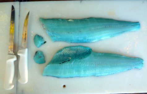
Lingcods are sometimes found with amazing, edible blue flesh. A bile pigment called biliverdin seems to be the cause, but exactly how it gets into the flesh of the fish remains a mystery. Cooking destroys the color, but if you are wanting to eat a turquoise colored food, this seems like a possible choice.

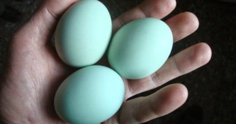
There is also a chicken that lays blue or turquoise eggs. It’s called an Araucana. Here’s a picture of the eggs, and yes, they are real. When you crack them open, they look like any other egg.
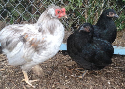
Here’s a picture of the breed of chicken that lays these eggs:
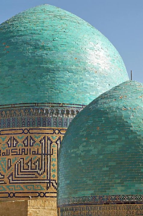
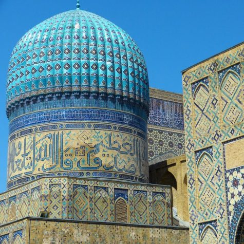
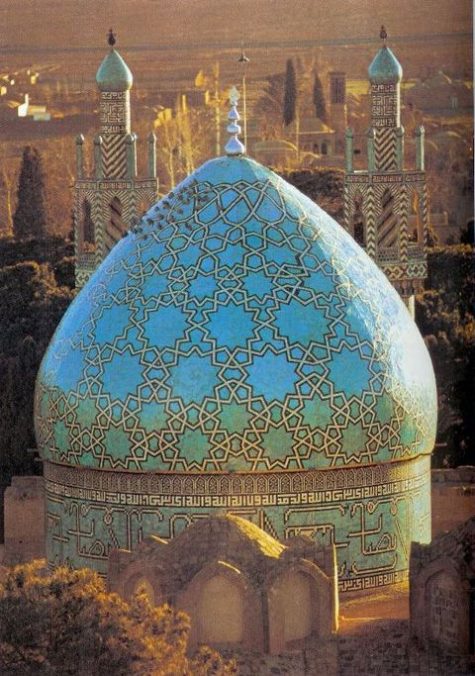
Turquoise and Architecture
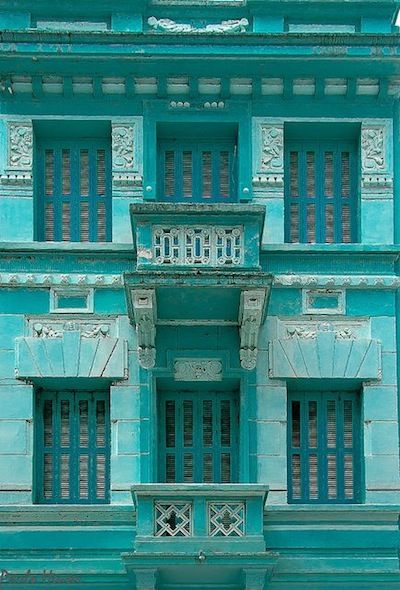
Turquoise is a stone and color that is strongly associated with the domes and interiors of large mosques in Iran, Central Asia and Russia. Turquoise is a blend of green and blue. It is so named because the Turks were fond of the color and decorated many of their buildings with turquoise ceramic glazed tiles.
Traditionally, the guiding formative motif of Iranian architecture has been its cosmic symbolism “by which man is brought into communication and participation with the powers of heaven”. This theme has not only given unity and continuity to the architecture of Persia, but has been a primary source of its emotional character as well.
Iran (previously known in the West as Persia) has remained an important source of turquoise for at least 2,000 years. It was initially named by Iranians “pirouzeh” meaning “victory”, and later the Arabs called it “firouzeh”. In Iranian architecture, the blue turquoise was used to cover the domes of palaces because its intense blue color was also a symbol of heaven on earth.
Here are some beautiful examples:
Healing With The Color Turquoise
In healing Turquoise can help to calm hyperactive or hypersensitive people . Turquoise calms the mind and is cooling to the nervous system. assists immunity and is one of the colors for throat chakra. It is a powerful cleanser and can be used as an all purpose higher octave color for healing. It can be used to improve the circulation and healing effect of energy in general.
Healing with the color turquoise:
- Turquoise is important for respiratory system and in strengthening the metabolism.
- It is cooling to the system, and can be beneficial in easing all feverish conditions and for balancing all systems of the body. It can also be used to cool and ease any inflammation.
- Combines both the beneficial effects of blue and green.
- It vitalizes all systems. It is also purifying.
- In treating febrile diseases, change to turquoise when the temperature is normal.
- Turquoise is useful in treating skin conditions, throat problems, and it is very effective for acute pain and earaches.
- Turquoise is a prime skin-building color and should be used after the pain from burns is relieved. Turquoise hastens the formation of new skin.
- It eases respiration problems. It is effective in treatment of asthma and bronchitis, especially with children. Regular color breathing with turquoise or aqua can prevent intense attacks of asthmatic conditions.
- Turquoise is good for immune system, skin (burns and infections), mental relaxation, acidic, tonifier, regulates lung/large intestine systems.
- Turquoise stimulates the Thymus center, or Higher Heart Chakra.
- Increases intuition and sensitivity.
- Turquoise is a cerebral depressant for over-active mental patients.
- It enhances the ability to focus and concentrate, assisting with clear thinking and decision-making, and the development of good organizational skills.
- Works as a disinfectant and antiseptic.
- Tones the general system.
- Relaxes sensations of stress.
- It is calming yet invigorating, restoring depleted energies.
- It resonates to the thymus and thyroid glands of our endocrine system.
- Turquoise has a strengthening influence on all systems of the body bringing a sense of inner confidence.
- Treats disillusionment and apathy
- Also good for communication issues, cleansing , breath issues, physical detox , rebirthing , purification , sterilization , transition , pain, and hearing.
Turquoise imbalance:
- Too much of this color in your life may give you an overactive mind and create emotional imbalance, making you either over-emotional or non-emotional.
- Too little turquoise in your life may cause you to withhold your emotions, resulting in secrecy and confusion about your direction in life.
Note: This post was compiled by Shirley Twofeathers for Color Therapy, you may repost and share without karmic repercussions, but only if you give me credit and a link back to this website. Bright Blessings.
The Color Turquoise
“She would be half a planet away, floating in a turquoise sea,
dancing by moonlight to flamenco guitar.”
― Janet Fitch, White Oleander
Turquoise is a blend of green and blue. It is so named because the Turks were fond of the color and decorated many of their buildings with turquoise ceramic glazed tiles.
Turquoise has the calming, expansive nature of green and the cool, quiet flow of blue. It can bring to mind a particular quality in the sky before or after sunset, a calm, warm sea, a beautiful lagoon, a pure mountain stream or distant hills in the mellow light of late summer
Turquoise is the color of the deep subconscious. Since the lungs vibrate in the green range, turquoise also belongs to the lungs, especially to the higher vibration of the lungs, which is spirituality, creativity, intuition, imagination, and the synchronistic quality of bring “in tune” with nature, with oneself, with “the flow.” The process of psychic opening is assisted with the color turquoise, as well as violet, and wearing turquoise around the neck is good for the voice, expression, creativity, since the root urge of creativity is to express.
This is a color that recharges our spirits during times of mental stress and tiredness, alleviating feelings of loneliness. You only have to focus on the color turquoise, whether on a wall or clothing and you feel instant calm and gentle invigoration, ready to face the world again!
It is a great color to have around you, particularly in an emergency, as it helps with clear thinking and decision-making. It assists in the development of organizational and management skills. It influences rather than preaching and demanding.
This is a good color to aid concentration and clarity of thought for public speakers as it calms the nervous system, gives control over speech and expression, and builds confidence. Print your speech notes on turquoise and every time you glance down you will feel the effects of the color.
It heightens levels of creativity and sensitivity; it is good at multi-tasking, becoming bored if forced to focus on one thing only. Sometimes thinking can become scattered if surrounded by too much of this balancing color.
Turquoise’s essence is clear, fresh, focused, youthful, imaginative, transformational, clean, sensitive, changing, rarefied, new, and victorious. Turquoise encourages inner healing through its ability to enhance empathy and caring. It heightens our intuitive ability and opens the door to spiritual growth. It is the color of the evolved soul. Turquoise encourages clarity in thoughts, feelings, and communication.
Note: This post was compiled by Shirley Twofeathers for Color Therapy, you may repost and share without karmic repercussions, but only if you give me credit and a link back to this website. Bright Blessings.
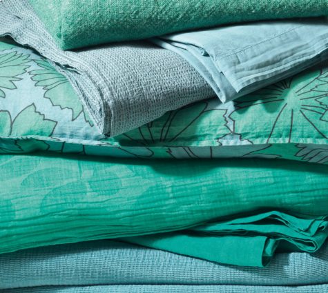
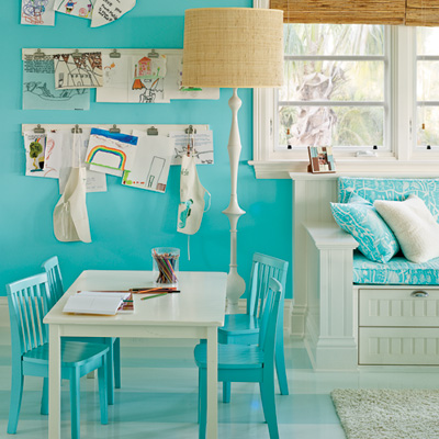
Designing With Turquoise
A mix of blue and green, turquoise has a sweet feminine feel while the darker teal shades add lively sophistication.
~ Jacci Howard Bear
Turquoise is, generally thought to consist of 70% blue and 30% green. A blend of blue and green, shades of turquoise, have the same calming effects of those colors and shares the symbolism and characteristics of both colors. Aqua, aquamarine, beryl, blue-green, cerulean, teal and ultramarine are all names for turquoise colors.
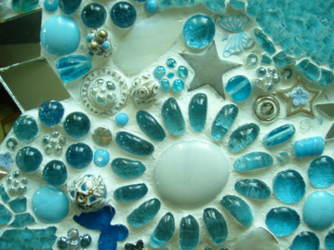
Turquoise is much more than another color from the gemstone lineup. Its many shades, hues and tones combine to paint a world of joyousness and glee. Just like the gemstone, the color is deeply ingrained in human history as one that brings peace, harmony and lasting happiness. Native Indians believed that this fallen sky stone had an ability to ward off evil and offer health. Similarly the color has been embraced by cultures across the world as one that energizes interiors while providing pleasure and serenity.
This in-between color represents water, thus the names aqua and aquamarine. Like still water, it projects peace and tranquility. It is an open and friendly color that offers balance and stability. Turquoise is linked to emotional balance and serenity.
The positive connotations connected with turquoise color are sophistication, healing, protection and spirituality. The negative connotations are envy and—from a design standpoint with the light bright shades—femininity.
The color turquoise undoubtedly takes its name from the valuable and popular mineral of the same name often used in jewelry. Turquoise is closely associated with the Middle East and the American Southwest. jewelry. Turquoise is closely associated with the Middle East and the American Southwest.
From the mosaics of the ancient world, the aqua clay paint accents of Northwest Native American works to the rather kitchy “modern ” of the fifties, such as cone shaped plastic chairs , and lava lamps, these shades have been used in a startling range of ways.
Turquoise is equally popular with men and women. Although the dark shades of turquoise are perceived to be masculine, you can create feminine appeal in your design with the light shades of turquoise.
Some shades of turquoise have a ’50s or ’60s retro feel. Teal has a darker, somewhat more sophisticated look. Like the mineral, turquoise shades range from almost sky blue to deep greenish blues.
Keep the soft, feminine qualities going in a design by combining turquoise with lavender or pale pink. Bright turquoise and pink create a sparkly clean, retro look.
Make it art deco by pairing turquoise with white and black. Turquoise with gray or silver as well as terra cotta and light brown has an American Southwest flavor. Turquoise combined with orange or yellow creates a fresh, sporty look. The color is often used in tropical designs.
TURQUOISE COLOR SELECTIONS
 If your graphic design project is headed for print, use the CMYK formulations for the turquoise color you choose or specify a spot color. If your project will be viewed onscreen, use the RGB values. Use Hex codes if you work with websites. Turquoise colors include:
- Pale Turquoise: Hex #aeeeee | RGB 174,238,238 | CMYK 27,0,0,7
- Turquoise: Hex #00c5cd | RGB 0,197,205 | CMYK 100,4,0,20
- Bright Turquoise: Hex #00e5ee | RGB 0,229,238 | CMYK 100,4,0,7
- Medium Turquoise: Hex # | RGB 72,209,204 | CMYK 66,0,2,18
- Aquamarine: Hex #7fffd4 | RGB 127,255,212 | CMYK 50,0,17,0
Note: This post was compiled by Shirley Twofeathers for Color Therapy, you may repost and share without karmic repercussions, but only if you give me credit and a link back to this website. Bright Blessings.
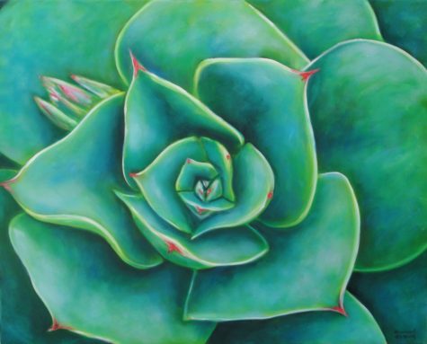
Variations of the Color Turquoise
Aqua: Closer to green than blue, aqua is refreshing and uplifting. It is creative and light-hearted, yet strong and individual.
Aquamarine: Enhancing creativity and inspiration, the color aquamarine calms and balances the mind and the emotions. May indicate a sedentary person, a bit lazy, who may spends a bit too much time meditating.
Teal: A more sophisticated version of turquoise, teal signifies trustworthiness and reliability. It promotes spiritual advancement and commitment.
Blue Green: Indicates a dreamy person, emotional, thinker rather than a doer, insight, someone with the perception who sees possibilities. They mean well but may presume to know what is right for everyone else.
Purple Planet Earth
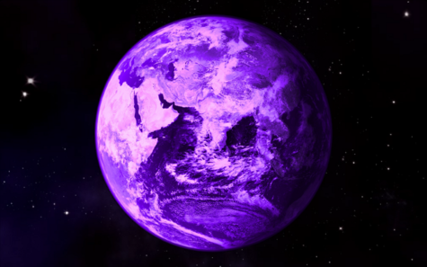
The earliest life on Earth might have been just as purple as it is green today, a scientist claims.
Ancient microbes might have used a molecule other than chlorophyll to harness the Sun’s rays, one that gave the organisms a violet hue.
Chlorophyll, the main photosynthetic pigment of plants, absorbs mainly blue and red wavelengths from the Sun and reflects green ones, and it is this reflected light that gives plants their leafy color. This fact puzzles some biologists because the sun transmits most of its energy in the green part of the visible spectrum.
“Why would chlorophyll have this dip in the area that has the most energy?” said Shil DasSarma, a microbial geneticist at the University of Maryland.
After all, evolution has tweaked the human eye to be most sensitive to green light (which is why images from night-vision goggles are tinted green). So why is photosynthesis not fine-tuned the same way?
Possible answer
DasSarma thinks it is because chlorophyll appeared after another light-sensitive molecule called retinal was already present on early Earth. Retinal, today found in the plum-colored membrane of a photosynthetic microbe called halobacteria, absorbs green light and reflects back red and violet light, the combination of which appears purple.
Primitive microbes that used retinal to harness the sun’s energy might have dominated early Earth, DasSarma said, thus tinting some of the first biological hotspots on the planet a distinctive purple color.
Being latecomers, microbes that used chlorophyll could not compete directly with those utilizing retinal, but they survived by evolving the ability to absorb the very wavelengths retinal did not use, DasSarma said.
“Chlorophyll was forced to make use of the blue and red light, since all the green light was absorbed by the purple membrane-containing organisms,” said William Sparks, an astronomer at the Space Telescope Science Institute in Maryland, who helped DasSarma develop his idea.
Chlorophyll more efficient
The researchers speculate that chlorophyll- and retinal-based organisms coexisted for a time. “You can imagine a situation where photosynthesis is going on just beneath a layer of purple membrane-containing organisms,” DasSarma told LiveScience.
But after a while, the researchers say, the balance tipped in favor of chlorophyll because it is more efficient than retinal.
“Chlorophyll may not sample the peak of the solar spectrum, but it makes better use of the light that it does absorb,” Sparks explained.
DasSarma admits his ideas are currently little more than speculation, but says they fit with other things scientists know about retinal and early Earth.
For example, retinal has a simpler structure than chlorophyll, and would have been easier to produce in the low-oxygen environment of early Earth, DasSarma said.
Also, the process for making retinal is very similar to that of a fatty acid, which many scientists think was one of the key-ingredients for the development of cells.
“Fatty acids were likely needed to form the membranes in the earliest cells,” DasSarma said.
Lastly, halobacteria, a microbe alive today that uses retinal, is not a bacterium at all. It belongs to a group of organisms called archaea, whose lineage stretches back to a time before Earth had an oxygen atmosphere.
Taken together, these different lines of evidence suggest retinal formed earlier than chlorophyll, DasSarma said.
The team presented its so-called “purple Earth” hypothesis earlier this year at the annual meeting of the American Astronomical Society, and it is also detailed in the latest issue of the magazine American Scientist. The team also plans to submit the work to a peer-reviewed science journal later this year.
Caution needed
David Des Marais, a geochemist at NASA’s Ames Research Center in California, calls the purple Earth hypothesis “interesting,” but cautions against making too much of one observation.
“I’m a little cautious about looking at who’s using which wavelengths of light and making conclusions about how things were like 3 or 4 billion years ago,” said Des Marais, who was not involved in the research.
Des Marais said an alternative explanation for why chlorophyll doesn’t absorb green light is that doing so might actually harm plants.
“That energy comes screaming in. It’s a two-edged sword,” Des Marais said in a telephone interview. “Yes, you get energy from it, but it’s like people getting 100 percent oxygen and getting poisoned. You can get too much of a good thing.”
Des Marais points to cyanobacteria, a photosynthesizing microbe with an ancient history, which lives just beneath the ocean surface in order to avoid the full brunt of the Sun.
“We see a lot of evidence of adaptation to get light levels down a bit,” Des Marais said. “I don’t know that there’s necessarily an evolutionary downside to not being at the peak of the solar spectrum.”
Implications for astrobiology
If future research validates the purple Earth hypothesis, it would have implications for scientists searching for life on distant worlds, the researchers say.
“We should make sure we don’t lock into ideas that are entirely centered on what we see on Earth,” said DasSarma’s colleague, Neil Reid, also of the STScI.
For example, one biomarker of special interest in astrobiology is the “red edge” produced by plants on Earth. Terrestrial vegetation absorbs most, but not all, of the red light in the visible spectrum. Many scientists have proposed using the small portion of reflected red light as an indicator of life on other planets.
“I think when most people think about remote sensing, they’re focused on chlorophyll-based life,” DasSarma said. “It may be that is the more prominent one, but if you happen to see a planet that is at this early stage of evolution, and you’re looking for chlorophyll, you might miss it because you’re looking at the wrong wavelength.”
Violet – In Depth
The learned compute that seven hundred and seven millions of millions of vibrations have penetrated the eye before the eye can distinguish the tints of a violet. ~Lytton
The word violet is from the Middle English and old French violette, and from the Latin viola, the names of the violet flower. The first recorded use of violet as a color name in English was in 1370.
Violet can also refer to the first violas which were originally painted a similar color.
In Arabic language Violet color is called Nile and the dye Nilege made from Viola flower (of the violet color) which was dominant on the shores of the Nile River, giving the Nile color as the name of the Nile river. The Violet shade of Blue is called Nili in Contemporary Arabic.
In Chinese painting, the color violet represents the harmony of the universe because it is a combination of red and blue (Yin and yang respectively). In Hinduism and Buddhism violet is associated with the Crown Chakra.
Violet is one of the oldest colors used by man. Traces of very dark violet, made by grinding the mineral manganese, mixed with water or animal fat and then brushed on the cave wall or applied with the fingers, are found in the prehistoric cave art in Pech Merle, in France, dating back about twenty-five thousand years.
More recently, the earliest dates on cave paintings have been pushed back farther than 35,000 years. Hand paintings on rock walls in Australia may be even older, dating back as far as 50,000 years.
It has also been found in the cave of Altamira and Lascaux. It was sometimes used an alternative to black charcoal. Sticks of manganese, used for drawing, have been found at sites occupied by Neanderthal man in France and Israel. From the grinding tools at various sites, it appears it may also have been used to color the body and to decorate animal skins.
Berries of the genus rubus, such as blackberries, were a common source of dyes in antiquity. The ancient Egyptians made a kind of violet dye by combining the juice of the mulberry with crushed green grapes. The Roman historian Pliny the Elder reported that the Gauls used a violet dye made from bilberry to color the clothing of slaves. These dyes faded quickly in sunlight and when washed.
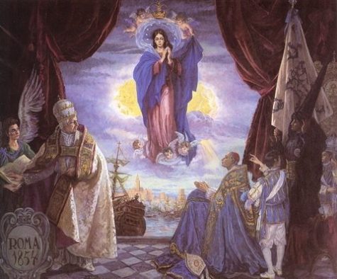
During the Middle Ages violet was worn by bishops and university professors and was often used in art as the color of the robes of the Virgin Mary. Violet and purple retained their status as the color of emperors and princes of the church throughout the long rule of the Byzantine Empire.
While violet was worn less frequently by Medieval and Renaissance kings and princes, it was worn by the professors of many of Europe’s new universities. Their robes were modeled after those of the clergy, and they often square violet caps and violet robes, or black robes with violet trim.
Violet also played an important part in the religious paintings of the Renaissance. Angels and the Virgin Mary were often portrayed wearing violet robes. The 15th-century Florentine painter Cennino Cennini advised artists: “If you want to make a lovely violet colour, take fine lacca, ultramarine blue (the same amount of the one as of the other)…” For fresco painters, he advised a less-expensive version, made of a mixture of blue indigo and red hematite.
The violet or purple necktie became very popular at the end of the first decade of the 21st century, particularly among political and business leaders. It combined the assertiveness and confidence of a red necktie with the sense of peace and cooperation of a blue necktie, and it went well with the blue business suit worn by most national and corporate leaders.
Seeing Violet:
Violet is at one end of the spectrum of visible light, between blue and the invisible ultraviolet. It has the shortest wavelength of all the visible colors. Violet is a spectral, or real color – it occupies its own place at the end of the spectrum of light. Violet is the color the eye sees looking at light with a wavelength of between 380 and 450 nanometers. It was one of the colors of the spectrum first identified by Isaac Newton in 1672.
In the traditional color wheel used by painters, violet and purple lie between red and blue. Violet is inclined toward blue, while purple is inclined toward red.
Symbolic meanings of violet:
- Knowledge and intelligence
- Piety
- Sobriety
- Humility
- Temperance
- Peace
- Spirituality
 Spectral Coordinates:
- Wavelength: 380-450 nm
- Frequency: 800-715 THz
Color Coordinates:
- Hex triplet: #8F00FF
- sRGBB: (143, 0, 255)
- CMYKH: (44, 100, 0, 0)
- HSV: (274°, 100%, 100%)
Note: This post was compiled by Shirley Twofeathers for Color Therapy, you may repost and share without karmic repercussions, but only if you give me credit and a link back to this website. Blessed be.
Using The Color Violet
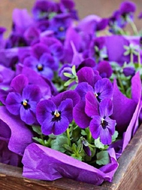
Look at us, said the violets blooming at her feet, all last winter we slept in the seeming death but at the right time God awakened us, and here we are to comfort you. ~Edward Payson Rod
 Wearing Violet:
Violet is often worn by people predisposed toward psychic matters, and is the perfect symbol of the “higher” mind, combining as it does the earthy, fieriness of red with the cool reasonableness of blue to forge an entirely different hue.
Absolutely wear violet when:
- You wish to make positive changes in your life and when you are looking for a purpose
- When you wish to feel special and unique and show other people that you are a non-conformist
- When you want to eliminate anger, destructive attitudes and addictions
Do not wear violet under the following conditions:
- If you suffer from depressive disorders
- If you are absent-minded and daydreaming
- If you feel stuck in any kind of grief
An Overdose of Violet:
Excess violet may be overpowering and suppress inner feelings and emotions, especially anger. It may also cause a sense of disquiet. You should always balance it with yellow!
Put some violet in your life when:
- You wish to re-balance your life
- There is a need to speed up the natural healing of the body.
- You have a desire to use your imagination to its fullest, and apply that imagination in practical ways.
- You wish to integrate new skills into every day life.
- There is a desire to remove obstacles.
- You have a need to calm over activity.
Questions to ask yourself when drawn to violet:
- Is there a need for self healing?
- What are you sacrificing to appear as a “good” or “helpful” person?
Ways to use violet:
- Violet is a great color to use in rooms where you practice relaxation and meditation techniques, as well as in spaces intended for introspective and contemplative thinking such as studios, libraries, bedrooms, verandas, and gardens.
- Violet stimulates blood flow to the brain, and it can be used to enhance intuition, imagination and creativity. When creating and composing his operas, Richard Wagner surrounded himself with this amazing color.
- Violet can be also very helpful for those suffering from insomnia or stress. Adorning your home with flowers like violets, lavender, lilacs, and orchids, or wearing gems such as amethyst, purple fluorite, sugulite, lepidolite, and charoite, will help you eliminate worries and doubts, and achieve inner balance and mental peace.
- Violet is also used to alleviate migraines. Crystal healers suggest placing an amethyst on the center of the forehead to relieve pain.
- Violet is also a good appetite suppressant. Eating more violet foods such as eggplants, purple cabbage, grapes, blueberries, and blackberries, will help you relax and keep hunger at bay.
- Wearing violet clothes or violet night gowns will help you become more calm, intuitive, creative and contemplative!
Loving violet:
Not loving violet:
Note: This post was compiled by Shirley Twofeathers for Color Therapy, you may repost and share without karmic repercussions, but only if you give me credit and a link back to this website. Blessed be.

I think it's time to go shopping... maybe even buy some really cool stuff at my online shops!!