Monthly Archives: September 2017
Red vs Smallpox
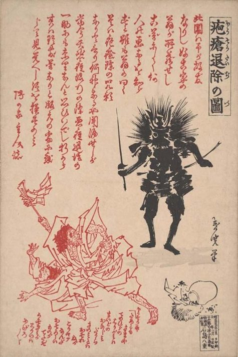
Hosogami are smallpox spirits. (Hoso is the Japanese word for smallpox.) For safe recovery to health, the Hosogami must be soothed, propitiated, and sent on their way. Hosogami are pleased to see the color red. Physicians were glad to see the color red too:
- Purple smallpox rashes indicate the illness is in a dangerous stage.
- If and when rashes turn red, the patient is expected to recover.
The person suffering from small pox and those caring for him dressed in red to appease the Hosogami. In addition, “red prints” or hoso-e prints, paper wall amulets were posted at the first hint of small pox to propitiate, avoid, and/or banish the illness.
Daruma and Shoki possess the power to expel Hosogami and are among the spirits portrayed on red smallpox talismans. They are called “red” because that’s the primary color of these prints. If no print is available, red banners may suffice.

Following the patient’s recovery, these prints were traditionally ritually burned or floated down rivers to signal the departure of the spirit. Extremely few survive and these are now extremely valuable collectors items.
Borrowed from: The Powers That Be
Colorizing the Kitchen
Home decor is often viewed as simply a matter of aesthetics — what looks attractive. But proponents of color psychology believe that the colors you use to decorate your home can have a profound effect on the emotional well-being of you and your family.
“Color is a universal, nonverbal language, and we all intuitively know how to speak it,” says Leslie Harrington, a color consultant in Old Greenwich, Conn. and a noted expert on the use of color in residential and industrial decor. “What color you paint your walls isn’t just a matter of aesthetics. It’s a tool that can be leveraged to affect emotions and behavior.”
Color consultants say that if you have fond memories of spending time in the kitchen when you were a kid, it might make sense to recreate the color scheme in your grown-up kitchen. “If you grew up in a blue-and-white kitchen and have great memories, blue and white may be the best colors for you and your family,” says Smith.
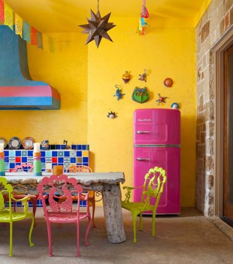
If there’s no particular paint scheme you remember fondly, reds and yellows can be great colors in the kitchen as well as in the living room and foyer. But watch out if you’re watching your weight: in addition to stimulating conversation, color consultants say that red may prompt you to eat more, if only subtly. “If you’re on a diet, you might want to keep red out of the kitchen,” Harrington says, adding that the restaurant industry has long recognized the appetite-stimulating power of red decor.
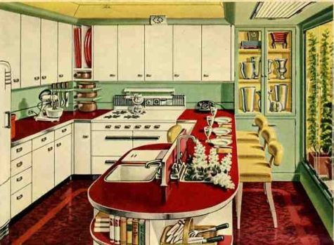
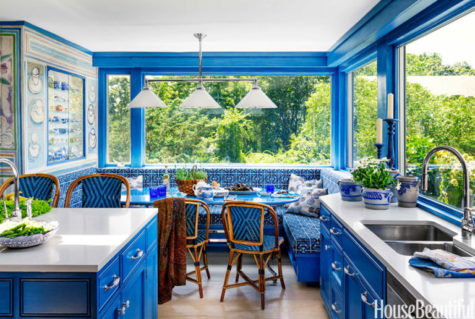
The Best Paint Colors for Every Type of Kitchen
Painting your kitchen walls is one of the quickest, and easiest ways to re-do a kitchen. Before you rush out and buy gallons of paint, think carefully about what your dream kitchen looks like. Experts agree that it’s not just the color on the walls that determine how a kitchen looks and feels. How the wall paint color relates to the cabinetry, countertops, tiles, molding, appliances, lighting and flooring is very important.
Before you buy paint, test sample swatches on your walls and observe how the colors look at various times during the day and evening. Bring all your color influencers into the room so you can see how the paint looks with all the various elements.
Paint Color Basics
- Tip #1: Colors can change
Keep in mind that natural sunlight in the kitchen will change in intensity throughout the day. Morning light appears differently than evening light, and shadows can affect the color perception. Color is essentially light – how we perceive a color depends greatly on how light is reflecting off of that color. There is a term used to describe this color-changing experience: illuminant metameric failure. It simply means that two colors may look similar in one light condition but might not match in another. So understanding the light patterns in your kitchen, and knowing what other colors will be going into the kitchen, is incredibly important.
- Tip #2: Select your paint color at home
Don’t choose a paint color while standing in the paint store aisle. Bring home actual paint samples (many brands offer small sample jars) that you can apply to your walls. Paint these swatches next to cabinetry, flooring, countertops and any fabrics you plan on using in the space. Observe how the paint changes during the day and notice if any of your other kitchen materials are affected by light hitting the paint and reflecting onto the surface. For example, a strong red wall color may, at certain times of the day, reflect a pink hue onto white cabinetry or flooring.
- Tip #3: Warm colors work
There’s a reason we see a lot of warm, earthy tones in the kitchen. Kitchens harken back the days of open fires and slow roasted foods. Studies have shown that our appetites increase when we see red or orange colors. Although warm hues may be a popular choice for kitchens, it doesn’t mean you have to ignore blues and greens. Pair cool tones with warm neutrals like a warm gray or warm orange. You’ll be surprised how mixing the palette can create the kitchen of your dreams.
- Tip #4: Paint isn’t just for walls
Don’t forget that paint can be used on a variety of kitchen elements: cabinets, tables, chairs and other decorative objects. If your favorite paint color won’t work on the walls, try using it on a piece of furniture instead. Vintage pieces or new pieces can be painted (or spray painted). Test the underside or backside first to make sure you’ve selected the right type of paint for your project.
Best Colors For:
- Northern Exposure:
Northern light is cool, indirect, and even in appearance, making it the preferred light of artists and painters. Light from northern exposure won’t shift as much throughout the day, so expect a more even color tone in the room. The cooler sunrays will enhance cooler colors like blues and greens. Even cool tones of white will look good in northern light.
- Southern Exposure:
Southern light is stronger, more direct and tends to shift throughout the day. This might make your paint colors look very different at different times. You might notice that the strong sunlight makes paint colors reflect onto nearby surfaces. Kitchens with a southern exposure can do well with all walls being painted with the same color but keep in mind that during the day, each wall might appear to be a different shade. As the warm light will draw out warmth in the color, choose earthy colors.
- Eastern Exposure:
An eastern exposure kitchen will have strong sunlight first thing in the morning and lots of shade in the afternoon. Expect shadowing throughout the day as the sun moves across the sky. You can play up the effect of the sun by having a kitchen with contrasting colors. Think light cabinets and darker walls.
- Western Exposure:
Kitchens facing west will have strong sunlight in the afternoon and into the early evening. Dark colors will help absorb excessive light (and heat). Combine strong cabinet colors with a lighter tone like Ivory Brown. Light cabinets might do well with an offset color.
- No Windows:
A windowless kitchen will need to rely on artificial light. The best kitchen will have a combination of task lighting, overhead light and ambient light and the types of bulbs you use will greatly influence the type of light. Incandescent and halogen bulbs cast warmer, more yellow, tones. These bulbs will bring out warmer hues and cast a warm glow in the room. Fluorescent or cooler bulbs will cast a blue or green hue into the space. Try a neutral blue.
- Tiny Kitchen:
You don’t have to steer away from dark colors in a small kitchen. In fact, having a mix of contrasting colors can help the kitchen feel larger. Depending on your cabinet color, a strong paint like Rapture (4001-6B) has enough blue and red, as well as gray, to make it work with a variety of other colors. Adding rows of shelving and utilizing the kitchen’s vertical space can help break up the paint while maximizing storage.
- Open Floor Plan:
Open kitchens, with nearby dining rooms or family rooms, will need to be color-conscious when it comes to walls. Not only will your paint color need to match the kitchen elements, you’ll want to make sure that it coordinates with the other rooms as well. When selecting a color, try a gray-infused neutral that will go with a variety of color palettes.
- Lots Of Wood Cabinets:
If you have a lot of wood cabinetry in your kitchen you’ll want to be smart about your color selection. Do you want the cabinetry to disappear? Try a paint color that is a shade or two lighter than the cabinets. Do you want to compliment the wood and show it off? Find a paint color from a different palette that has complimentary tones.
- Outdated Countertops:
If all you can afford to do is repaint your walls, don’t worry. Paint can help downplay or distract from any unattractive features in the kitchen. Colors that dominate, or play up your favorite color, will do well. Consider painting three of the walls the same color as the cabinets (to hide them) and use the fourth wall as a strong accent color.
- Stainless Steel Appliances:
Stainless steel appliances have a cool, but gray, appearance, making them a good neutral for the kitchen. However, kitchens with too much stainless steel in the kitchen run the risk of looking cold and utilitarian. Offset the cold by introducing a warm color.
- Black Appliances:
Black appliances, like stainless steel, can look cold and dark. In some kitchens they may appear like black holes within the space. So balancing these strong elements is key for the kitchen. Depending upon the cabinet colors, a warm brown can create a sophisticated look next to black.
- If You Rent:
The best reason for using a neutral paint color on the wall of a rental is that it will be much easier to paint over once you move out. But neutrals don’t have to be boring. If you prefer cool tones, a gray-blue color will work with nearly any color scheme. Warm neutrals will also work well.
- If You Have A Dark Backsplash:
Do you want your backsplash to stand out or disappear? If you want it to stand out, then choose a much lighter color. Some black backsplashes can pair well with similar dark colors.
- If You Have A Light Backsplash:
Light backsplashes, like white or cream, can work well with a variety of paint colors. A bright chalk white will really show off the veining in white marble, for example. Sophisticated grays can also be a great compliment to light colors. Be careful about really dark colors next to white – the color may reflect onto the surface and change the color to one you don’t want.
- If Your Kitchen Also Functions As An Entryway:
If your kitchen serves as the main entry to the home, you’ll want to be less conscious of the color and more aware of the type of paint you use. Be sure you select a paint designed for heavy traffic and can easily wipe down, like a semi-gloss finish. Texture is important too. A smooth wall will show marks faster than a more textured one.
Borrowed from: The Prosperity Project
Best colors for a closet
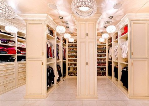
You may not give much thought to the inside of your closets when painting a room but paint pros say that choosing the right color and sheen will not only improve the appearance of your closet but yours as well. No more reaching into a dark closet and grabbing the navy blouse instead of the black one. Debbie Zimmer of the Paint Quality Institute has some pointers on what to consider when painting a closet.
- An open closet.
Your best bet with a closet or storage space that’s open to the rest of the room is to paint it the same color as the room or a slightly lighter shade. That way it’s more integrated and less likely to draw attention to what’s inside.
- Your primary closet.
You’ll want the closet where you store your wardrobe to be bright so you can actually see the color of your clothing. White or a light color are good choices. Choose a paint with a shinier sheen such as semi-gloss, which will reflect more light.
- Pantry or bathroom closets.
Use a durable paint in your pantry and other closets where you store things that may spill or get sticky. Use a semi-gloss sheen that stands up to scrubbing. As for color, choose one that blends in with the room.
- Your junk closet.
For those catch-all closets where you stash off-season sporting goods, boots, cleaning supplies, or other gear, think about a darker color that de-emphasizes what’s inside. And keep the door closed
- Guest room closet.
You can be more playful with a closet in a guest room that’s used infrequently. Try a contrasting color. That way when your guests open the door they get a pop of color. Zimmer says that darker colors are more forgiving and can make dust less noticeable.
DESIGN TIP:
Interior designers recommend that you keep the color in your closet subtle and neutral. There really is no need to put substantial color in this room. Here’s why:
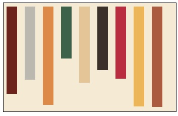
This graphic represents a neutral closet. The background is an off white or beige and the rectangles are your clothes. We all have just about every color from lights to darks in our closets so having the background a neutral will visually make the closet more appealing and easier to see. It’s really a small detail that will make a large impact in your closet.
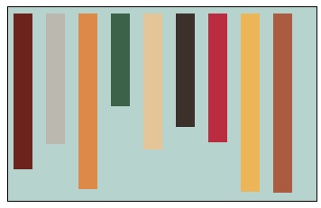
Now this closet was painted the same coastal blue that’s been trending for quite some time. So many people have this color in their bedroom and have taken it into their closet but look what happens. It’s very unsettling to see all this color in a closet. The color of your clothes fight with the blue and it just becomes a mess. It’s like painting every room in your home a different and unrelated color. It doesn’t make sense and it’s just ugly! By the way – the color of the “clothes” are the same in both these graphics but see how different they look?
According to Feng Shui principles, white is the ideal color as it opens the energy more, as well as brings the crisp quality of the metal feng shui element.
So, I was thinking about red or maybe orange… I did some experimenting with the graphic, even made one a bright white. Here’s a sampling of the different colors:
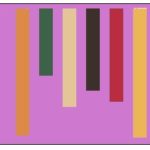
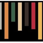


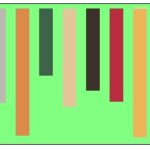

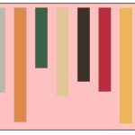


Wow… I really like the black! I wonder if I could make it work in real life, or if it just looks good because it’s on a digital graphic instead of on a wall.
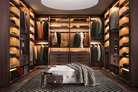
So my friends, whether you have a very large walk in closet or a very small closet, take the time out to finish it. And remember, color matters!
Borrowed from: The Prosperity Project
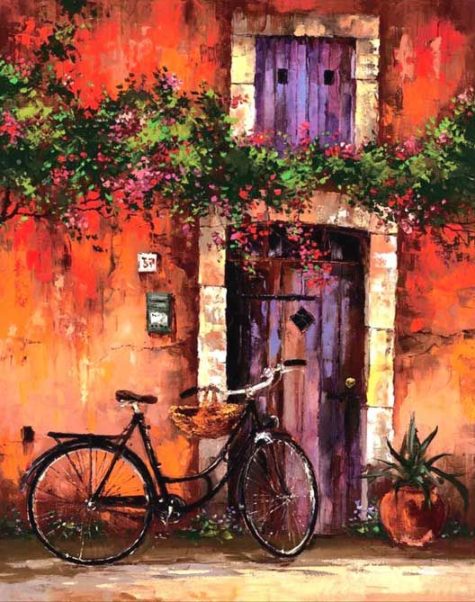
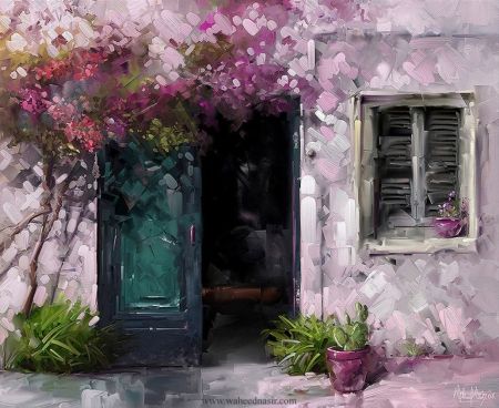
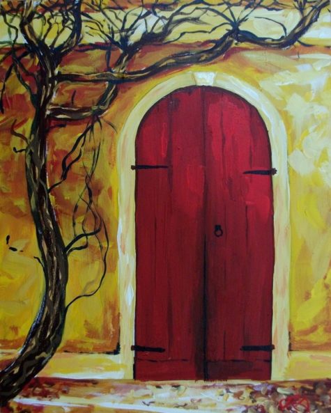
Colorizing Your Front Door
In feng shui, the front door is considered the called the mouth of Chi. It is through the front door that the house receives its feng shui nourishment of energy. The quality of this energy determines the quality of energy in your home. In classical feng shui, the choice of most auspicious color is based on the direction of the front door and its corresponding feng shui element.
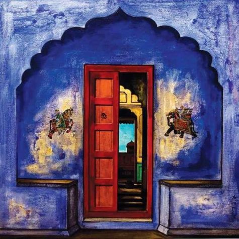
Feng shui is all about good energy, and you can welcome this energy with a strong, auspicious feng shui front door. Because it is through the front door that the house absorbs most of the energy it needs in order to nourish your personal energy, it is important to do your best in creating a strong feng shui front door.
The easiest way to do that is to find the appropriate feng shui design for your door – be it with colors, shapes, images or materials. The best feng shui design is the one that nourishes the feng shui element that corresponds to the direction your front door is facing.
East
The feng shui element of the east is wood, so if your front door is facing east, your best choices are the wood element colors green and brown.
The Wood feng shui element is nourished by the Water feng shui element and supported by the Earth feng shui element, so you can also choose the colors of these two elements.
To sum it up for you, best feng shui colors for an East facing front door are (in order of their auspiciousness): green, brown, blue, black, very light yellow and all earthy colors.
Avoid the following colors for your East facing front door: red, purple, white and gray. These colors represent the element of Fire and Metal that are destructive to Wood.
Southeast
The color choices for your southeast front door are similar to an east facing door because they share the same feng shui element. The feng shui element of the Southeast direction is the Wood element, and the corresponding feng shui bagua energy is Money and Abundance.
In case of a Southeast facing front door, you have additional color choices because there are two more elements that bring good energy to this area. These two elements – the Water and the Earth feng shui elements – are both nourishing and supportive of Wood, so you can use their colors, too, for your Southeast facing front door
Because a Southeast facing door is considered a prosperity door in feng shui, often the best color and design choices are those corresponding to the Water feng shui element, as water is the universal symbol of prosperity flow and abundance.
To sum it up, the best feng shui colors for a Southeast facing front door are (in order of their auspiciousness): green, blue, brown, black, very light yellow and all earthy colors.
Avoid the following colors for your Southeast facing front door: red, purple, white and gray. These colors represent the elements of Fire and Metal that are destructive to Wood.
South
South is the only direction with the fire feng shui element, so the best feng shui color for a South facing front door is the red, of course! Other feng shui fire element colors that are good for your South door are yellow, purple, orange and strong pink/magenta. As some of these colors might not work with your house exterior, here are a couple other color choices.
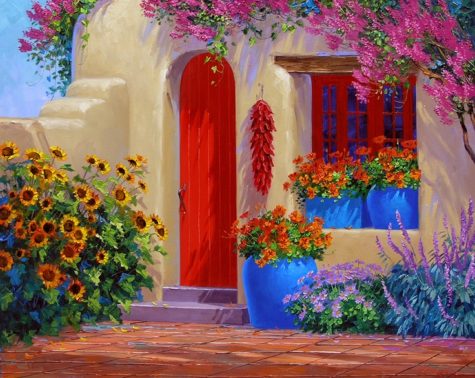
The element of Wood is nourishing for the Fire element/creates it, thus the Wood element colors are also good for a South-facing front door.
To sum it up for you, best feng shui colors for a South facing front door are (in order of their auspiciousness): red, purple, strong yellow, deep orange, deep pink, green and brown colors.
Avoid the following colors for your South facing front door: blue, black and all earthy colors. These colors represent the elements of Water and Earth that are destructive/weakening for the Fire element of South.
Southwest
The feng shui energy associated with a southwest door is maternal energy, as well as the energy of love and marriage. Because of this, you should choose a color of the Earth element or go for a color of a feng shui element that nourishes Earth.
In case of a Southwest facing front door, there is one more feng shui element that you can use for an additional choice of colors. The element of Fire is nourishing for the Earth element/creates it, thus the Fire element colors are also good for a Southwest facing front door.
So, the best feng shui colors for a Southwest facing front door are (in order of their auspiciousness): earthy/sandy colors, yellow, burgundy red, purple, deep orange, and rich pink.
Avoid the following colors for your Southwest facing front door: green, brown, white, gray, blue and black. These colors represent the elements of Wood, Metal and Water that are destructive/weakening for the Earth element of the Southwest bagua area.
West
For a western facing door go for the colors of the metal feng shui element, which are white and gray. If they’re a little bland for your tastes, you can also go back to Earth element color choices for your western facing front door.
In the case of a West facing front door, there is one more feng shui element you can use; this gives you a wider range of good colors. The element of Earth is nourishing for the Metal element, thus all Earth element colors are also good for a West facing front door.
So, the best feng shui colors for a West facing front door are (in order of their auspiciousness): white, gray, light yellow and all earthy/sandy colors.
Avoid the following colors for your West facing front door: blue, black, red, purple, orange, and deep pink. These colors represent the elements of Water and Fire that are weakening/destructive for the Metal element of West direction.
Northwest
A northwest front door has the same best color choices as the western facing door because both directions share the same feng shui element of metal. However, because in feng shui the northwest direction is associated with helpful people, you might need to pay extra attention to it.
In the case of a Northwest facing front door, you can also use the colors of the Earth feng shui element, as this element is nourishing/creates the Metal element.
So, the best feng shui colors for a Northwest facing front door are (in order of their auspiciousness): white, gray, light yellow and all earthy/sandy colors.
Avoid These Colors for Your Northwest Facing Front Door: blue, black, red, purple, orange, and deep pink. These colors represent the elements of Water and Fire that are weakening/destructive for the Metal element of Northwest direction.
North
North is the only direction of the feng shui element of water, so the best choices for a north facing door are the water element colors, black and blue. If these two colors do not work well with your house exterior, you can go for metal element colors.
In case of a North facing front door, there is one more feng shui element that you can use for an additional choice of colors. The element of Metal is nourishing for the Water element/creates it, thus Metal element colors are also good for a North facing front door.
So, the best feng shui colors for a North facing front door are (in order of their auspiciousness): blue, black, white and gray.
Avoid the following colors for your North facing front door: green, brown, yellow, red, purple, orange, and deep pink. These colors represent the elements of Wood, Earth and Fire that are weakening/destructive for the Water element of North direction.
Northeast
A northeast facing front door is an opening to the energy of spiritual growth and cultivation. Its feng shui element is Earth. When you have a Northeast facing front door, there is one more feng shui element that you can use as an additional choice of color.
The feng shui element of Fire is nourishing for the Earth element because it creates it, thus the Fire element colors are also good for a Northeast facing front door.
So, the best feng shui colors for a Northeast facing front door are (in order of their auspiciousness): earthy/sandy colors, yellow, burgundy red, purple, deep orange, and rich pink.
Avoid the following colors for your Northeast facing front door: green, brown, white, gray, blue and black. These colors represent the feng shui elements of Wood, Metal and Water that are destructive/weakening for the Earth element of the Northeast area.
Borrowed from: The Prosperity Project


I think it's time to go shopping... maybe even buy some really cool stuff at my online shops!!