Individual Colors
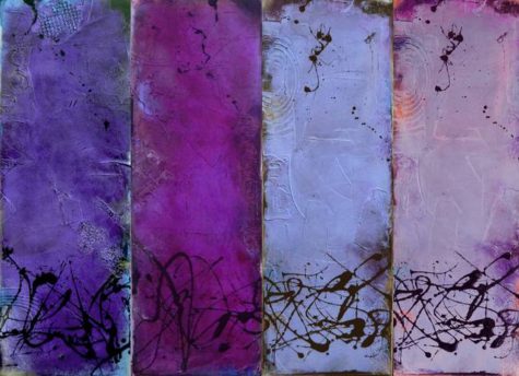
Variations of the Color Violet
Who in the rainbow can draw the line where the violet tint ends and the orange tint begins? Distinctly we see the difference of the colors, but where exactly does the one first blendingly enter into the other?
~Herman Melville
Purple: The color purple is specifically associated with royalty and the nobility, creating an impression of luxury, wealth and extravagance. Purple has power. It has a richness and quality to it that demands respect. Purple is ambitious and self-assured, the leader.
Light purple: Represents feminine energy and delicacy, as well as romantic and nostalgic feelings.
Deep purple: Dark purple is related to higher spiritual attainment. A powerful color, it can also indicate arrogance and ruthlessness, and may evoke feelings of gloom, sadness, and frustration.
Bright purple: Suggests riches and royalty.
Mauve: Mauve helps us to make the best choices and decisions; it is concerned for justice to be done and always does the right thing. On the other hand it can indicate a degree of commonness, the social climber aspiring to higher ideals.
Lavender: Lavender is attracted to beautiful things. It has a fragility, sensitivity and vulnerability to it. Lavender is a feminine, graceful, elegant color that has long been associated with refined, wealthy women.
Lilac: Lilac implies immaturity, superficiality and youthfulness. It is extroverted and enthusiastic, inspiring glamour, romance, and vanity.
Amethyst: A mystical color, amethyst opens intuitive channels. It protects the vulnerable and assists the humanitarian. It is the color of the evolved soul.
Plum: An old-fashioned color, plum is honorable and linked to family traditions. It is also prudish and narrow-minded, always preaching at you.
Note: This post was compiled by Shirley Twofeathers for Color Therapy, you may repost and share without karmic repercussions, but only if you give me credit and a link back to this website. Blessed be.
Violet – The Correspondences
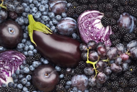
Foods that work in a violet way:
- Purple sprouting broccoli
- Plums
- Purple cabbage
- Grapes
- Eggplant
- Purple berries
Herbs that work in a violet way:
- Purple basil – a sacred herb of meditation
- St John’s wort
- Potassium
- Peyote
Violet essential oils:
- Carnation
- Clove
Violet crystals and stones:
- Amethyst
- Flourite
- Iolite
Healing With the Color Violet
The violets in the mountains have broken the rocks.
~Tennessee Williams
 Overview:
Violet is at the opposite end of the spectrum from red. It is a deeply healing and cleansing color, soothes pains in body, mind and spirit. This color is known as one of the “cool” colors. The color violet has a very calming effect on us and is, therefore, very helpful for those people experiencing sleep difficulties or stress. However, it can be contra-indicated for those suffering from depressive disorders.
Violet light slows down an over-active heart; stimulates the spleen and the white blood cells (immunity). Brings sleep. Soothes mental and emotional stress. Decreases sexual activity. Decreases sensitivity to pain. Helps in detoxification. Exposure to violet light is good for mental and emotional problems, rheumatism, epilepsy, deep tissue work, and bones.
Healing with the color violet:
- Good for mental disorders, the nervous system, baldness and female complaints.
- Helps with pain, is used in deep tissue work and to heal bones, suppresses appetite.
- Can promote inner peace.
- Good for migraines, analgesic, stimulates the immune system.
- Helps with spiritual healing, inner balance, a tranquilizer, promotes sleep. Sedates and subdues.
- Rebuilds the energy body template.
- Used sparingly, violet can be good for mental and nervous disorders and emotional disturbances.
- Maintains potassium balance, reduces hunger.
- Purifies the entire system.
According to Dinshah Ghadiali’s Spectro-Chrome Therapeutic System, violet light demonstrates the following qualities:
- Splenic Stimulant
Increases the Functional Activity of the Spleen - Cardiac Depressant
Decreases the Functional Activity of the Heart - Lymphatic Depressant
Decreases the Functional Activity of the Lymphatic Glands for Nutrition. - Motor Depressant
Decreases the Functional Activity of the Motor Nervous System, which energizes the Muscles into Motion. - Leucocyte Builder
Builds the White (truly the Violet) Corpuscles in the Spleen
Contra-Indications:
- Overuse can be tiring
- Do not use for depression, use green or blue instead.
Violet is balanced by the color yellow.
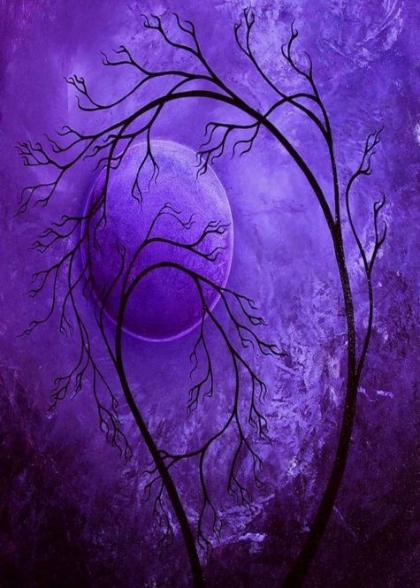
 The Violet Flame
The Violet Flame (also called the violet fire) is a unique spiritual energy that can help you in all areas of your life. Lots of people use the mystical image of the Violet Flame which represents the light of divine freedom.
It is used in cleansing, protection, meditation, and to burn off karma from other lifetimes. It can heal emotional and physical problems, improve your relationships, help you to grow spiritually, or just make life easier.
More information on the Violet Flame can be found at:
Note: This post was compiled by Shirley Twofeathers for Color Therapy, you may repost and share without karmic repercussions, but only if you give me credit and a link back to this website. Blessed be.
Violet vs Purple
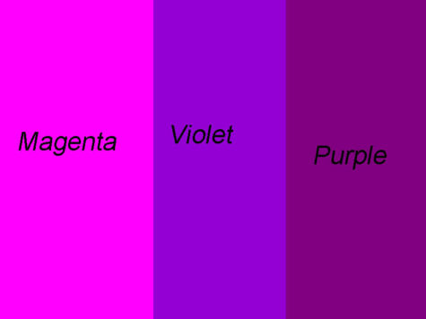
In the traditional color wheel used by painters, violet and purple are both placed between red and blue. Purple occupies the space closer to red, between crimson and violet. Violet is closer to blue, and is usually less intense and bright than purple. While the two colors do look similar, from the point of view of optics there are important differences.
Violet is a spectral, or real color – it occupies its own place at the end of the spectrum of light, and it has its own wavelength (approximately 380-420 nm). It was one of the colors of the spectrum first identified by Isaac Newton in 1672, whereas purple is simply a combination of two colors, red and blue. There is no such thing as the “wavelength of purple light”; it only exists as a combination.
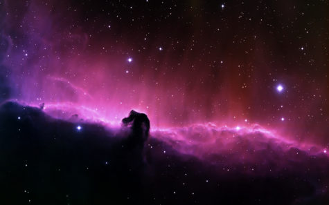
The Color Violet
Violet has the shortest wavelength of the spectrum.
Behind it, the invisible ultraviolet.
~Derek Jarman
Violet is the color of purpose and is associated with imagination and inspiration.. Violet is associated with the Crown chakra. This chakra is the main coordination center of the body and ensures you are connected to universal sources of energy.
Leonardo da Vinci proclaimed that you can increase the power of meditation tenfold by meditating under the gentle rays of Violet, as found in Church windows.
Violet is the door to the unseen. It is the color of the sky at sunset. It is a deeply healing and cleansing color which soothes pains in body, mind, and spirit. It is said if you surround yourself with violet you will have peace of mind.
Violet is an important energy for those who use blue and indigo skills in the psychic field. The red in violet offers a grounding effect.
Violet is the color of good judgment. It is the color of people seeking spiritual fulfillment.
Violet is the color of transformation. It heals melancholy, hysteria, delusions and alcohol addiction and bring spiritual insights and renewal. This color slows down an over-active heart; stimulates the spleen and the white blood cells (immunity). Brings sleep. Soothes mental and emotional stress. Decreases sexual activity. Decreases sensitivity to pain. Helps in detoxification.
Note: This post was compiled by Shirley Twofeathers for Color Therapy, you may repost and share without karmic repercussions, but only if you give me credit and a link back to this website. Blessed be.
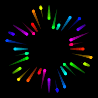
Migraine Cure with Red / Green
I have had good success eliminating a migraine prodrome aura. I cured it by using a special eye exercise. The procedure was intended to work the eyes and the visual centers of the brain harder than usual by forcing them to do a cross-eye fusion procedure. The speculation behind the possible success using this method was based upon a reported brain scan done during migraine attacks which showed an abnormal blood flow to the visual cortex located in the back of the brain. These cross-eye procedures force the brains visual centers to do far more work than is usually required of them and that forces the brain to allocate the blood flow in a different way from what they were doing to create the migraine aura.
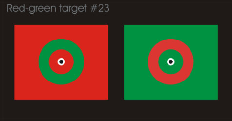
This is an experimental procedure which I performed upon myself. I am only reporting what appeared to work for me and I do not necessarily suggesting that you try the experiment so any results you may have, good, bad or inconclusive are strictly upon your own recognizance. However, below are the cross-eye charts which I used successfully to eliminate my visual hallucinations in about three minutes. Usually it takes about 30 to 50 minutes in a dark room with a hot or cold bag on the back of my head to clear up the aura. I have tried both the hot and cold treatments but found that tapping the back of the head worked better. But this cross-eye treatment worked best of all.
What works for me is to look cross-eyed at my finger tip held between the flags about half way to the screen and then to slowly move it towards and away from my face while looking at my finger tip and thinking about the dot. At some point the central dots from the opposite fields fuse into one. When they fuse I slowly lower my finger out of sight while watching the dot. And then in about twenty seconds the light show begins. With Red-green target #36 I like to move my stare between the various smaller dots around the center and to slowly read the numbers and letters. If my eyes uncross I return my finger to the position where fusion took place and can usually get the fusion back in a few seconds.
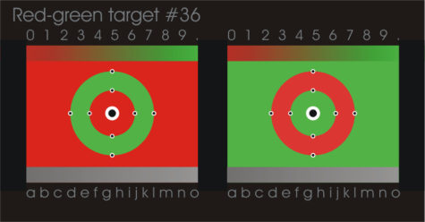
Here is a different graphic to play around with:
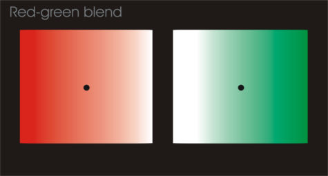
And another one:
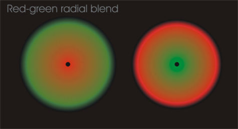
I created these pictures for the cross-eye fusion experiments but I discovered that they confused my visual centers so much that the effort of fusion soon forced my brain to abandon migraine auras and give its attention to the fusion. Even under normal non-aura brain functioning these pictures created highly volatile liable images which will shift quickly through a variety of colors and golden blends.
For more detail on these cross-eye fusion experiments go to the previous mind fuzing experiments. Here is a group of similar eye experiments with more instructions on how to cross your eyes: Eye Experiments.
Please remember these are experiments and you are totally responsible for any strange effects or results. I intended them for learning how your perception works and how it sometimes does very strange and unexpected things.
Source: Probaway
Green In Media And Design
Some of the ways the color green is used in the media and for design purposes:
- Green has strong emotional correspondence with safety.
- Dark green is also commonly associated with money.
- Green suggests stability and endurance.
- Green, as opposed to red, means safety; it is the color of free passage in road traffic.
- Use green to indicate safety when advertising drugs and medical products.
- Green is directly related to nature, so you can use it to promote ‘green’ products.
- Dull, darker green is commonly associated with money, financial world, banking, and Wall Street.
Submitted by Raetta Parker
Yellow In Media And Design
Some of the ways the color yellow is used in the media and for design purposes:
- Yellow is often associated with food.
- Bright, pure yellow is an attention grabber that’s why taxicabs are painted this color.
- Yellow is seen before other colors when placed against black; this combination is often used to issue a warning.
- Use yellow to evoke pleasant, cheerful feelings.
- Yellow is very effective for attracting attention, so use it to highlight the most important elements of your design.
- Men usually perceive yellow as a very lighthearted, ‘kiddish’ color, so it is not recommended to use yellow when selling prestigious, expensive products to men – nobody will buy a yellow business suit or a yellow Mercedes.
- Yellow is an unstable and spontaneous color, so avoid using yellow if you want to suggest stability and safety.
- Light yellow tends to disappear into white, so it usually needs a dark color to highlight it.
- Shades of yellow are visually unappealing because they loose cheerfulness and become dingy.
Submitted by Raetta Parker
Red In Media And Design
Some of the ways the color red is used in the media and for design purposes:
- Red brings text and images to the foreground.
- Use it as an accent color to stimulate people to make quick decisions; it is a perfect color for ‘Buy Now’ or ‘Click Here’ buttons on Internet banners and websites.
- This color is also commonly associated with energy, so you can use it when promoting energy drinks, games, cars, items related to sports and high physical activity.
Submitted by Raetta Parker
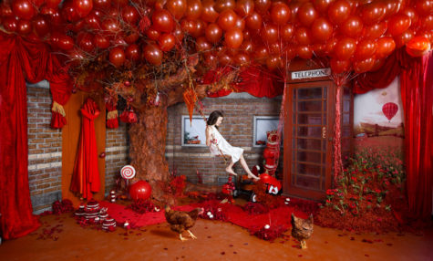
Red Is A Green Issue

Red keeps us rooted in the red energy of our planet. People who become detached or divorced from the planet tend to be those who abuse it. These people often display some of the negative qualities that are associated with red – selfishness and an interest only in personal, rather than global, survival and short-term security.
To be healthy in a long term sense, we need the color red to reconnect ourselves to the planet and support it as it supports us. For our personal development, the role involves taking responsibility for our own well being and survival as part of humanity as a whole, not being separate from it. Although often seen as a “green” issue, global and local conservation is also about survival, which is a red issue. Red and green issues are intrinsically linked as they are complementary colors.
Source Unknown
I think it's time to go shopping... maybe even buy some really cool stuff at my online shops!!