Yearly Archives: 2016
Red In Media And Design
Some of the ways the color red is used in the media and for design purposes:
- Red brings text and images to the foreground.
- Use it as an accent color to stimulate people to make quick decisions; it is a perfect color for ‘Buy Now’ or ‘Click Here’ buttons on Internet banners and websites.
- This color is also commonly associated with energy, so you can use it when promoting energy drinks, games, cars, items related to sports and high physical activity.
Submitted by Raetta Parker
Red Is A Green Issue

Red keeps us rooted in the red energy of our planet. People who become detached or divorced from the planet tend to be those who abuse it. These people often display some of the negative qualities that are associated with red – selfishness and an interest only in personal, rather than global, survival and short-term security.
To be healthy in a long term sense, we need the color red to reconnect ourselves to the planet and support it as it supports us. For our personal development, the role involves taking responsibility for our own well being and survival as part of humanity as a whole, not being separate from it. Although often seen as a “green” issue, global and local conservation is also about survival, which is a red issue. Red and green issues are intrinsically linked as they are complementary colors.
Source Unknown
Feeling Red
Phrases like “red light district” and “scarlet woman” aptly describe the sexual nature of red. Some aspects of red behavior are not socially acceptable. Red together with black is associated with evil, for example in the archetypal “red devil” of medieval artists.
Blatant expression of emotion is not always easy to handle, whether it is sexuality, passion, anger or aggression. When expressing red emotions, the heart beats faster, the capillaries dilate and the skin becomes flushed and feels warm.
Red is thought of as an immediate color. This affects the thinking processes, causing restlessness and impatience. Red can result in very selfish behavior, a focus on personal needs and survival above everything else.
Sometimes the drive to survive is what fuels impulsive actions and rash comments. When these traits are managed well they create capable business people who are innovators and entrepreneurs, preferring to move from one project to another, getting an operation on its feet then moving on. They are gifted with being able to manifest new ideas. Often people with red traits are also renowned for their daring exploits, and they can be somewhat extroverted and boastful about their skills.
Red brings focus to the physicality of life, to the process of living. The color is symbolic of what we need to survive. Life should be grabbed and lived with a sense of immediacy. Without red we become listless and out of touch with reality and we fail to live our dreams in this world. Without the foundation that red gives us we just daydream of escaping into fantasy worlds.
Source unknown
Forbidden Colors
Try to imagine reddish green — not the dull brown you get when you mix the two pigments together, but rather a color that is somewhat like red and somewhat like green. Or, instead, try to picture yellowish blue — not green, but a hue similar to both yellow and blue.
Is your mind drawing a blank? That’s because, even though those colors exist, you’ve probably never seen them. Red-green and yellow-blue are the so-called “forbidden colors.” Composed of pairs of hues whose light frequencies automatically cancel each other out in the human eye, they’re supposed to be impossible to see simultaneously.
The limitation results from the way we perceive color in the first place. Cells in the retina called “opponent neurons” fire when stimulated by incoming red light, and this flurry of activity tells the brain we’re looking at something red. Those same opponent neurons are inhibited by green light, and the absence of activity tells the brain we’re seeing green. Similarly, yellow light excites another set of opponent neurons, but blue light damps them. While most colors induce a mixture of effects in both sets of neurons, which our brains can decode to identify the component parts, red light exactly cancels the effect of green light (and yellow exactly cancels blue), so we can never perceive those colors coming from the same place.
Almost never, that is. Scientists are finding out that these colors can be seen — you just need to know how to look for them.
Colors without a name:
The color revolution started in 1983, when a startling paper by Hewitt Crane, a leading visual scientist, and his colleague Thomas Piantanida appeared in the journal Science. Titled “On Seeing Reddish Green and Yellowish Blue,” it argued that forbidden colors can be perceived. The researchers had created images in which red and green stripes (and, in separate images, blue and yellow stripes) ran adjacent to each other. They showed the images to dozens of volunteers, using an eye tracker to hold the images fixed relative to the viewers’ eyes. This ensured that light from each color stripe always entered the same retinal cells; for example, some cells always received yellow light, while other cells simultaneously received only blue light.
 The observers of this unusual visual stimulus reported seeing the borders between the stripes gradually disappear, and the colors seem to flood into each other. Amazingly, the image seemed to override their eyes’ opponency mechanism, and they said they perceived colors they’d never seen before.
Wherever in the image of red and green stripes the observers looked, the color they saw was “simultaneously red and green,” Crane and Piantanida wrote in their paper. Furthermore, “some observers indicated that although they were aware that what they were viewing was a color (that is, the field was not achromatic), they were unable to name or describe the color. One of these observers was an artist with a large color vocabulary.”
Similarly, when the experiment was repeated with the image of blue and yellow stripes, “observers reported seeing the field as simultaneously blue and yellow, regardless of where in the field they turned their attention.”
It seemed that forbidden colors were realizable — and glorious to behold!
Crane’s and Piantanida’s paper raised eyebrows in the visual science world, but few people addressed its findings. “It was treated like the crazy old aunt in the attic of vision, the one no one talks about,” said Vince Billock, a vision scientist. Gradually though, variations of the experiment conducted by Billock and others confirmed the initial findings, suggesting that, if you look for them in just the right way, forbidden colors can be seen.
Then, in 2006, Po-Jang Hsieh, then at Dartmouth College, and his colleagues conducted a variation of the 1983 experiment. This time, though, they provided study participants with a color map on a computer screen, and told them to use it to find a match for the color they saw when shown the image of alternating stripes — the color that, in Crane’s and Piantanida’s study, was indescribable.
“Instead of asking participants to report verbally (and hence subjectively), we asked our participants to report their perceptions in a more objective way by adjusting the color of a patch to match their perceived color during color mixing. In this way, we discovered that the perceived color during color mixing (e.g., red versus green) is actually a mixture of the two colors, but not a forbidden color,”
When shown the alternating stripes of red and green, the border between the stripes faded and the colors flowed into each other — an as-yet-unexplained visual process known as “perceptual filling in,” or “image fading.” But when asked to pick out the filled-in color on a color map, study participants had no trouble zeroing in on muddy brown. “The results show that their perceived color during color mixing is just an intermediate color,” Hsieh wrote in an email.
So if the color’s name is mud, why couldn’t viewers describe it back in 1983? “There are infinite intermediate colors … It is therefore not surprising that we do not have enough color vocabulary to describe [them all],” he wrote. “However, just because a color cannot be named, doesn’t mean it is a forbidden color that’s not in the color space.”
Color fixation:
Fortunately for all those rooting for forbidden colors, these scientists’ careers didn’t end in 2006. Billock, now a National Research Council senior associate at the U.S. Air Force Research Laboratory, has led several experiments over the past decade that he and his colleagues believe prove the existence of forbidden colors. Billock argues that Hsieh’s study failed to generate the colors because it left out a key component of the setup: eye trackers. Hsieh merely had volunteers fix their gaze on striped images; he didn’t use retinal stabilization.
“I don’t think that Hsieh’s colors are the same ones we saw. I’ve tried image fading under steady fixation … and I don’t see the same colors that I saw using artificial retinal stabilization,” Billock said. In general, he explained, steady eye fixation never gives as powerful an effect as retinal stabilization, failing to generate other visual effects that have been observed when images are stabilized. “Hseih et al.’s experiment is valid for their stimuli, but says nothing about colors achieved via more powerful methods.”
Recent research by Billock and others has continued to confirm the existence of forbidden colors in situations where striped images are retinally stabilized, and when the stripes of opponent colors are equally bright. When one is brighter than the other, Billock said, “we got pattern formation and other effects, including muddy and olive-like mixture colors that are probably closer to what Hseih saw.”
When the experiment is done correctly, he said, the perceived color was not muddy at all, but surprisingly vivid: “It was like seeing purple for the first time and calling it bluish red.”
The scientists are still trying to identify the exact mechanism that allows people to perceive forbidden colors, but Billock thinks the basic idea is that the colors’ canceling effect is being overridden.
When an image of red and green (or blue and yellow) stripes is stabilized relative to the retina, each opponent neuron only receives one color of light. Imagine two such neurons: one flooded with blue light and another, yellow. “I think what stabilization does (and what [equal brightness] enhances) is to abolish the competitive interaction between the two neurons so that both are free to respond at the same time and the result would be experienced as bluish yellow,” he said.
You may never experience such a color in nature, or on the color wheel — a schematic diagram designed to accommodate the colors we normally perceive — but perhaps, someday, someone will invent a handheld forbidden color viewer with a built-in eye tracker. And when you peek in, it will be like seeing purple for the first time.
Astronauts Wear Orange
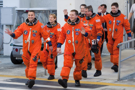
NASA wasn’t trying to make a fashion statement when it picked bright orange for the spacesuits astronauts wear when they launch and land on the space shuttle.
In fact, that bright hue called International Orange was chosen for safety, because it stands out so well against a landscape.
“It’s highly visible for search and rescue,” said Brian Daniel, shuttle crew escape subsystem manager at NASA’s Johnson Space Center in Houston. “It’s one of the most visible colors, especially for sea rescue.”
The same shade of orange coats San Francisco’s Golden Gate Bridge and Japan’s 1,090-foot (333-meter) tall Tokyo Tower.
The shuttle ascent and entry suit, called the Advanced Crew Escape Suit (ACES), is a pressurized shell designed to help an astronaut survive if an accident occurred during liftoff or landing. The suit contains a supply of air and water, along with a parachute and survival gear such as radios, flares and medicine.
The current version of the suit was adopted in 1994, though the previous version, called the Launch Entry Suit (LES), was the same color. [Graphic: Cosmic Apparel Over the Years]
Before the space shuttle, U.S. astronauts wore white or silver suits.
And today’s NASA astronauts wear a completely different suit for spacewalks, or extravehicular activities (EVAs). These suits are designed for a different purpose survival in the near-vacuum of space, rather than survival on Earth.
Thus EVA suits are white, which reflects the strong heat of the sun and stands out against the black expanse of space. These suits are called Extravehicular Mobility Units (EMUs), and are even bulkier than the ACES. They include temperature control, breathable air and drinkable water, and a tough shell to prevent small pieces of space junk, called micrometeoroids, from harming the astronauts.
Russia has its own spacesuits the Sokol suit for launch and landing, and the Orlan suit for spacewalks for those flying aboard Soyuz spacecraft. Both of these suits are white, and function similarly to their U.S. counterparts, with some differences.
China the third nation to independently launch humans into space has its own custom-designed spacesuits for spacewalking called Feitian suits, modeled on Orlan suits. Chinese astronauts have worn suits that closely resemble Sokol suits for launch and landing.
Color Matters More Than You Realize

Before snuggling up to a warm fire with a hot cup of cocoa this winter, you may want to take a second look at the cup holding the chocolate. The warm beverage may taste more flavorful in an orange cup or cream-colored cup, a new study suggests.
The results add to past work showing how factors that have nothing to do with food preparation can affect the taste of food.
“The color of the container where food and drink are served can enhance some attributes like taste and aroma,” said study co-author Betina Piqueras-Fiszman, a researcher at the Universitat Politècnica de València in Spain and the University of Oxford in the United Kingdom, in a statement.
In general, how people perceive taste is influenced by many factors unrelated to the actual food. Past studies have shown that the color of the plate, the price on a bottle of wine, and the verbal description of food can affect people’s enjoyment of dishes and drinks alike.
To see how hot chocolate enjoyment was affected by cup color, Piqueras-Fiszman and her colleagues asked 57 participants to rate samples of the same delicious beverage in four colors of plastic cup: white, cream, orange and red. (All cups were white on the inside.)
The participants said the drink was more flavorful when served in a cream- or orange-colored cup. Interestingly, participants rated the orange- and cream-colored cups of cocoa tastier despite the fact that participants didn’t say there were any significant differences in sweetness or aroma between the colored cups.
The new results may help restaurant owners and Martha Stewart types serve cocoa in a cup that maximizes the enjoyment of the hot drink.
The findings were published in the October issue of the Journal of Sensory Studies.
Why Red Is Such A Potent Color

Why is the color red so impressive? The answer lies in our tree-living past.
In the back of the vertebrate eyeball are two kinds of cells called rods and cones that respond to light. Cones take in a wide range of light, which means they recognize colors, and they are stimulated best during daylight. Rods respond to a narrower range of light (meaning only white light) but notice that light from far away and at night.
Isaac Newton was the first person to hold up a prism and refract white light into a rainbow of colors and realize that their might be variation in what the eye can see. Color comes at us in electromagnetic waves. When the wavelength of light is short we perceive purple or blue. Medium wavelengths of lights tickle the cones in an other way and we think green. Short light wavelengths make those cones stand up and dance as bright spots of yellow, orange and red.
Various animals distinguish only parts of that rainbow because their cones respond in different ways. Butterflies, for example, see into the ultraviolet end of the rainbow which allows them to see their own complex markings better than we can. Foxes and owls are basically color blind and it doesn’t matter because they are awake at night when the light spectrum is limited anyway.
Humans are lucky enough to be primates, animals with decent color vision, and we can thank monkeys for this special ability.
Long ago, primitive primates that resemble today’s lemurs and lorises saw only green and blue, the longer wavelengths of color. But when moneys evolved, around 34 million years ago, their cones became sensitive to even shorter wavelengths of color and they saw red.
And what a difference. With red, the forest comes alive. Instead of a blanket of bluish-green leaves, the world is suddenly accented with ripe red, yellow, and orange fruits, and even the leaves look different.
For a monkey leaping through the forest canopy, color vision would be an essential advantage. Unripe fruit doesn’t have enough carbs to sustain a hungry primate and they taste really sour. Unripe leaves not only taste bad, they are toxic and indigestible.
For the first humans foraging about the forest and savannah around 5 million years ago, it would have been be much more efficient to spot a ripe fruit or tuber than bite into a zillion just to get the right one. And so humans ended up with color vision even though we no longer live in trees.
But color is more than wavelengths, more than an indicator of ripeness, to us. Color has become symbolic, meaning it has meaning, and that meaning is highly cultural.
Chinese athletes and Chinese brides wear red because red is considered lucky. The U.S. athletes also wear red because that bright color is in the U.S. flag, and because designers of athletic wear, as well as scientists, know that red gets you noticed.
Living Red
Instinctively, the occurrence of red makes us wary, as we connect it with heat and the potential danger of burning. Red lights are built into artificial fires to help simulate the coziness of a real fire. Too much heat and red burns, but at the right level it supports our lives and gives us comfort.
Being the color of blood, red has symbolic links with living and life. Spilling or losing blood brings illness and death. Wearing red, eating red foods and surrounding yourself with red increases the body’s ability to absorb iron, the metal that is responsible for the color of hemoglobin in the blood. The presence of hemoglobin allows the blood to absorb oxygen in the lungs and to transport that life-giving oxygen to the cells of the body.
Physical activity and the energy that that supports it also has a red vibration. If speed, danger, daring or courage are involved, the red quality of the activity increases. Mountaineers, racing car drivers, and stuntmen all have “red” careers.
Source unknown
Red – What is it?
Red is any of a number of similar colors evoked by light consisting predominantly of the longest wavelengths of light discernible by the human eye, in the wavelength range of roughly 625-740 nm. Longer wavelengths than this are called infrared, or below red and cannot be seen by the naked human eye. Red is used as one of the additive primary colors of light, complementary to cyan, in RGB color systems. Red is also one of the subtractive primary colors of RYB color space but not CMYK color space.
Red’s wavelength has been an important factor in laser technologies as red lasers, used in early compact disc technologies, are being replaced by blue lasers, as red’s longer wavelength causes the laser’s recordings to take up more space on the disc than blue lasers.[10] Red light is also used to preserve night vision in low-light or night-time situations, as the rod cells in the human eye aren’t sensitive to red. Red is used as one of the additive primary colors of light, complementary to cyan, in RGB color systems. Red is also one of the subtractive primary colors of RYB color space but not CMYK color space.
One common use of red as an additive primary color is in the RGB color model. Because “red” is not by itself standardized, color mixtures based on red are not exact specifications of color either. In order to produce exact colors the color red needs to be defined in terms of an absolute color space such as sRGB. As used in computer monitors and television screens, red is very variable, but some systems may apply color correction (so that a standardized “red” is produced that is not in fact full intensity of only the red colorant).
A red filter used in black and white photography increases contrast in most scenes. For example, combined with a polarizer, it can turn the sky black. Films simulating the effects of infrared film (such as Ilford’s SFX 200) do so by being much more sensitive to red than to other colors. Red illumination was (and sometimes still is) used as a “safelight” while working in a darkroom, as it does not expose most photographic paper and some films. Though many more modern darkrooms use an amber safelight, red illumination is closely associated with the darkroom in the public mind.
Source” I’m not sure where I found this information.
Red On Women Drives Men Wild
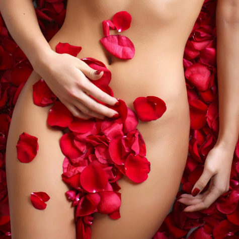
Red may be the color of love for a reason: It makes men feel more amorous towards women, a new study reports.
From ancient rituals to those red paper lace hearts on Valentines, red has been tied to carnal passions and romance in many cultures over the course of history.
In five psychological experiments, University of Rochester psychologists tested how different colors affected men’s attitudes towards women.
In one experiment, test subjects were shown a picture of a woman that was framed by either a red or white border and asked to answer a series of questions, such as: “How pretty do you think this person is?” Other experiments contrasted red with gray, green or blue (keeping saturation and brightness levels the same between the different hues).
In the final study, the shirt of the woman in the photo was digitally colored red or blue. In this experiment, men were questioned not only about their attraction to the woman, but about how they would plan a hypothetical date with her. For example, one question asked: “Imagine that you are going on a date with this person and have $100 in your wallet. How much would you be willing to spend on your date?”
In all the experiments, women shown framed by or wearing red were rated significantly more attractive and sexually desirable by men than the exact same women shown with other colors.
When wearing red, women were also more likely to be treated to a more expensive outing.
“It’s fascinating to find that something as ubiquitous as color can be having an effect on our behavior without our awareness,” said study team member Andrew Elliot.
The study, detailed in the Oct. 28 online edition of the Journal of Personality and Social Psychology, is said to be the first to scientifically document the effects of color on behavior in relationships.
Elliot and his co-author Daniela Niesta said the effect could be due to societal conditioning, though they attribute it to deeper biological roots because nonhuman male primates, such as baboons and chimpanzees, are known to be attracted to females displaying red.
The red effect applied only to males and only to their perceptions of attractiveness; it did not change their ratings of the pictured women in terms of likability, intelligence or kindness.
Other research suggests that the effect of color depends on the context. In a previous study, Elliot and his colleagues showed that seeing red in competitive situations, such as sporting events, leads to worse performance. Another recent study suggests that referees favor red-clad competitors because of a subconscious bias for the color.
I think it's time to go shopping... maybe even buy some really cool stuff at my online shops!!