Turquoise
Designing With Turquoise
A mix of blue and green, turquoise has a sweet feminine feel while the darker teal shades add lively sophistication.
~ Jacci Howard Bear
Turquoise is, generally thought to consist of 70% blue and 30% green. A blend of blue and green, shades of turquoise, have the same calming effects of those colors and shares the symbolism and characteristics of both colors. Aqua, aquamarine, beryl, blue-green, cerulean, teal and ultramarine are all names for turquoise colors.
Turquoise is much more than another color from the gemstone lineup. Its many shades, hues and tones combine to paint a world of joyousness and glee. Just like the gemstone, the color is deeply ingrained in human history as one that brings peace, harmony and lasting happiness. Native Indians believed that this fallen sky stone had an ability to ward off evil and offer health. Similarly the color has been embraced by cultures across the world as one that energizes interiors while providing pleasure and serenity.
This in-between color represents water, thus the names aqua and aquamarine. Like still water, it projects peace and tranquility. It is an open and friendly color that offers balance and stability. Turquoise is linked to emotional balance and serenity.
The positive connotations connected with turquoise color are sophistication, healing, protection and spirituality. The negative connotations are envy and—from a design standpoint with the light bright shades—femininity.
The color turquoise undoubtedly takes its name from the valuable and popular mineral of the same name often used in jewelry. Turquoise is closely associated with the Middle East and the American Southwest. jewelry. Turquoise is closely associated with the Middle East and the American Southwest.
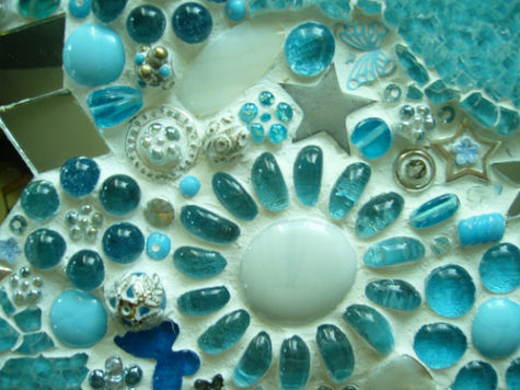
From the mosaics of the ancient world, the aqua clay paint accents of Northwest Native American works to the rather kitchy “modern ” of the fifties, such as cone shaped plastic chairs , and lava lamps, these shades have been used in a startling range of ways.
Turquoise is equally popular with men and women. Although the dark shades of turquoise are perceived to be masculine, you can create feminine appeal in your design with the light shades of turquoise.
Some shades of turquoise have a ’50s or ’60s retro feel. Teal has a darker, somewhat more sophisticated look. Like the mineral, turquoise shades range from almost sky blue to deep greenish blues.
Keep the soft, feminine qualities going in a design by combining turquoise with lavender or pale pink. Bright turquoise and pink create a sparkly clean, retro look.
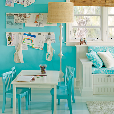
Make it art deco by pairing turquoise with white and black. Turquoise with gray or silver as well as terra cotta and light brown has an American Southwest flavor. Turquoise combined with orange or yellow creates a fresh, sporty look. The color is often used in tropical designs.
TURQUOISE COLOR SELECTIONS
 If your graphic design project is headed for print, use the CMYK formulations for the turquoise color you choose or specify a spot color. If your project will be viewed onscreen, use the RGB values. Use Hex codes if you work with websites. Turquoise colors include:
- Pale Turquoise: Hex #aeeeee | RGB 174,238,238 | CMYK 27,0,0,7
- Turquoise: Hex #00c5cd | RGB 0,197,205 | CMYK 100,4,0,20
- Bright Turquoise: Hex #00e5ee | RGB 0,229,238 | CMYK 100,4,0,7
- Medium Turquoise: Hex # | RGB 72,209,204 | CMYK 66,0,2,18
- Aquamarine: Hex #7fffd4 | RGB 127,255,212 | CMYK 50,0,17,0
Note: This post was compiled by Shirley Twofeathers for Color Therapy, you may repost and share without karmic repercussions, but only if you give me credit and a link back to this website. Bright Blessings.
Variations of the Color Turquoise
Aqua: Closer to green than blue, aqua is refreshing and uplifting. It is creative and light-hearted, yet strong and individual.
Aquamarine: Enhancing creativity and inspiration, the color aquamarine calms and balances the mind and the emotions. May indicate a sedentary person, a bit lazy, who may spends a bit too much time meditating.
Teal: A more sophisticated version of turquoise, teal signifies trustworthiness and reliability. It promotes spiritual advancement and commitment.
Blue Green: Indicates a dreamy person, emotional, thinker rather than a doer, insight, someone with the perception who sees possibilities. They mean well but may presume to know what is right for everyone else.
