Practical Applications
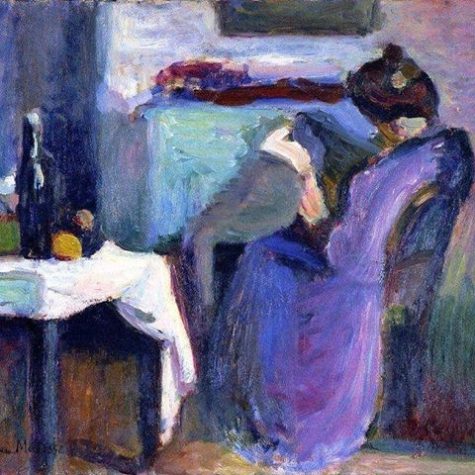
Blue in Media and Design
When I haven’t any blue I use red.
~Pablo Picasso
The effects of the color blue has an impact on many areas of life, including clothing choices, language and cliches, interior design, art, religion and health.
The cooling and relaxing qualities of blue, remind us of the peace and calmness of night. Clear blue is uplifting, while midnight night blue has a sedative effect that promotes meditation and intuition.
Blue is a very popular color, blue skies and blue water are full of positive meaning in every culture. We are, after all, living on the “blue planet.”
However, the color blue also has some negative associations due to the connection between lack of oxygen and blue skin color. It’s also true that too much dark blue can be depressing.
Despite the color’s gloomy connotations, research suggests that exposure to blue light can increase confidence and boost happiness levels. When researchers exposed a group of volunteers to a range of colors and lights. They found that blue and green made male subjects feel happier, while blue, purple and orange did the same for women.
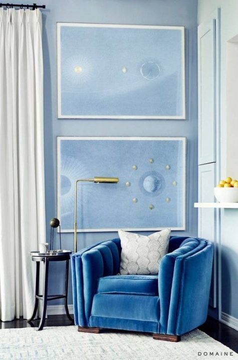
Blue and Interior Decor
Light and soft blue can alleviate insomnia and are good choices for bedrooms. Royal blue is appropriate for dining rooms and living rooms. Combinations of blue and yellow are often used in kitchens. Blue is also a natural choice for bathrooms due to the color symbolism association with water. Dark blue can be used successfully for meditation rooms.
Predominantly blue paintings are usually calm and refreshing. Artworks depicting rivers, waterfalls and the ocean often emphasize blue. Landscapes featuring large blue skies are also good options for introducing blue into your environment.
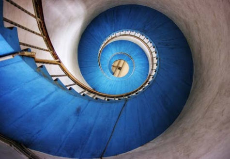
Most design motifs associated with blue are smooth, flowing patterns. Blue tends to be connected to asymmetrical, free form and curved images such as waves or meandering streams. Art featuring blue has almost universal appeal and is a good choice for gifts as well as personal use.
Note: This post was compiled by Shirley Twofeathers for Color Therapy, you may repost and share without karmic repercussions, but only if you give me credit and a link back to this website. Blessed be.
Using The Color Blue
The colour blue – that is my colour – and the colour blue means you have left the drabness of day-to-day reality to be transported into – not a world of fantasy, it’s not a world of fantasy – but a world of freedom where you can say what you like and what you don’t like. This has been expressed forever by the colour blue, which is really sky blue. ~Louise Bourgeois
Light blue rooms are said to increase productivity and to assist with study and focus. There are reports that people retain more information when reading blue text. Students may score higher on tests taken in blue surroundings . Some sport performance such as weightlifting , may be enhanced in blue surroundings. This is possibly because blue has the effect of calming people and of enhancing mental clarity. Blue is also a good color for bedrooms because of its calming and relaxing qualities it helps people be receptive to sleep. Darker shades of blue can be cold and depressing.
Questions to ask yourself when drawn to blue:
- Is there a need to talk to people around you?
- What do you need to express to others?
Put blue in your life when there is:
- A need to calm agitated, excitable, or chaotic states.
- Exposure to blue light can increase confidence and boost happiness levels.
- Blue is excellent for emotional healing of stress and anxiety in moderation. Too much blue can can increase depression and apathy in those so inclined.
- A need to communicate clearly.
- Use blue paper for notes when you want help in remembering a speech or other information.
- A need for peace, detachment, solitude, and rest.
- A need to help with new information or in seeing information in context.
- A block or limitation to the flow of information and/or frustration, disappointment, and lack of progress in your endeavors and relationships.
- By helping to soothe the mind, blue is the color of truth, serenity and harmony.
- It has a sobering effect on the mind and encourages contemplation, promotes group unity.
- It discourages disease and disharmony.
- Helps reduce and manage “hot” emotions like anger, impatience, greed, or jealousy. It can help with self control and in chaotic situations.
- A desire to broaden your perspective in learning new information.
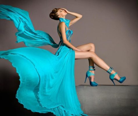
 Wearing Blue:
Blue denim is the most common clothing material in the western world. Men and boys in particular favor blue.Wear dark blues for a stable, calm conservative feeling. All shades of blue will help to make easy communication, whether it is with yourself or others.
Loving blue:
More people claim blue as their favorite color than any other color (over 50%). Blue cars have been among the top selling cars for decades.
In systems which correlate favorite colors with color symbolism, people who wear light blue are said to be analytical and have a practical approach to life. People who wear dark blue are intelligent and self-reliant and take on a great deal of responsibility. In any case, people are comfortable with blue and return to blue again and again.
Blue is often the chosen color by conservative people. Cool and soothing, dreamy and magical. Peace and rest. For people who keep a certain distance, but give calm and practical help; they are faithful and loyal, have a sense for order, logic and rational thinking. Flying in day-dreaming, ideals or nostalgia when felt misunderstood. Dark blue is more severe and can be melancholic. Blue is also the color of truth.
Not loving blue:
A person who has an aversion to blue, may be very disciplined, strong career worker, with an aversion to commentary or restriction. He may have charted out a clear direction for his life and wants to follow that no matter what.
Note: This post was compiled by Shirley Twofeathers for Color Therapy, you may repost and share without karmic repercussions, but only if you give me credit and a link back to this website. Blessed be.
Using Turquoise

Turquoise helps to open the lines of communication between the heart and the spoken word. It presents as a friendly and happy color enjoying life.
In color psychology, the color turquoise controls and heals the emotions creating emotional balance and stability. In the process it can appear to be on an emotional roller coaster, up and down, until it balances itself.A combination of blue and a small amount of yellow, turquoise fits in on the color scalebetween green and blue. It radiates the peace, calm and tranquility of blue and the balance and growth of green with the uplifting energy of yellow.
Turquoise recharges our spirits during times of mental stress and tiredness, alleviating feelings of loneliness. You only have to focus on the color turquoise, whether on a wall or clothing and you feel instant calm and gentle invigoration, ready to face the world again!
Turquoise is a great color to have around you, particularly in an emergency, as it helps with clear thinking and decision-making. It assists in the development of organizational and management skills. It influences rather than preaching and demanding.
The color turquoise is a good color to aid concentration and clarity of thought for public speakers as it calms the nervous system, gives control over speech and expression, and builds confidence. Print your speech notes on turquoise and every time you glance down you will feel the effects of the color.
Turquoise heightens levels of creativity and sensitivity. It is good at multi-tasking, becoming bored if forced to focus on one thing only. Sometimes its thinking can become scattered if surrounded by too much of this balancing color.
Turquoise encourages inner healing through its ability to enhance empathy and caring. It heightens our intuitive ability and opens the door to spiritual growth. It is the color of the evolved soul. Many meditations can begin with visualizing a pool of Turquoise water to gaze in or even to imagine diving into to receive messages from Dolphin and the Ocean Spirits.
Turquoise can also be self-centered, tuning in to its own needs above all others. At the same time, it can help us to build our self-esteem and to love ourselves, which in turn supports our ability to love others unconditionally. At its most extreme it can be boastful and narcissistic.
Although turquoise is self-sufficient, it fears being alone and can become aloof and unapproachable when this occurs, making the situation worse.
Turquoise has strong powers of observation and perception and can be quite discriminating. It has the ability to identify the way forward, the way to success, balancing the pros and cons, the right and wrong, of any situation. It is a good color to use when you are stuck in a rut and don’t know which way to move.
Turquoise can sometimes be impractical and idealistic and remote from emotional reactions, appearing excessively cool, calm and collected.
Positive and Negative Traits of Turquoise:
- Positive keywords include communication, clarity of thought, balance and harmony, idealism, calmness, creativity, compassion, healing and self-sufficiency.
- Negative keywords include boastfulness, secrecy, unreliability and reticence, fence-sitting, aloofness, deception and off-handedness.
Loving turquoise:
If this is your favorite color, you are friendly and approachable, easy to communicate with. You are compassionate, empathetic and caring. You have a heightened sense of creativity and sensitivity. You speak from the heart and love sharing your inner most thoughts.
Not loving turquoise:
A person who has an aversion to turquoise may be looking for solidity and security in society, especially in marriage. Also, may be reluctant to think originally or to walk new paths.
Wearing turquoise:
Tints of turquoise color have a sweet feminine feel. Darker shades of turquoise, such as teal have a more sophisticated feel. Variations of turquoise, are often used to represent water. This color is also is referred to as aqua and aquamarine. Wear turquoise jewelry to give yourself confidence and strength.
The Color Turquoise Represents
Communication:
Turquoise represents open communication from and between the heart and the spoken word. It relates to the electronic age and the world of computers, and communication on a large scale.
Emotional Control:
Being the mid color between the extremes of red and violet, turquoise is the color of balance, for the emotions, thoughts and speech.
Self-Sufficiency:
Turquoise has the ability to tune into its own needs and find the way to success.
Effects of the Color Turquoise
Clarity of Thought:
Turquoise enhances the ability to focus and concentrate, assisting with clear thinking and decision-making, and the development of good organizational skills.
Calming:
Turquoise is calming yet invigorating, restoring depleted energies.
Non-emotional:
A negative effect of turquoise is that it can cause people to be too aloof and to hide their emotional reactions.
Why Doctors Wear Green or Blue Scrubs

Scrubs used to be white — the color of cleanliness. Then in the early 20th century, one influential doctor switched to green because he thought it would be easier on a surgeon’s eyes, according to an article in a 1998 issue of Today’s Surgical Nurse. Although it is hard to confirm whether green scrubs became popular for this reason, green may be especially well-suited to help doctors see better in the operating room because it is the opposite of red on the color wheel.
Green could help physicians see better for two reasons. First, looking at blue or green can refresh a doctor’s vision of red things, including the bloody innards of a patient during surgery. The brain interprets colors relative to each other. If a surgeon stares at something that’s red and pink, he becomes desensitized to it. The red signal in the brain actually fades, which could make it harder to see the nuances of the human body. Looking at something green from time to time can keep someone’s eyes more sensitive to variations in red, according to John Werner, a psychologist who studies vision at the University of California, Davis.
Second, such deep focus on red, red, red can lead to distracting green illusions on white surfaces. These funky green ghosts could appear if a doctor shifts his gaze from reddish body tissue to something white, like a surgical drape or an anesthesiologist’s alabaster outfit. A green illusion of the patient’s red insides may appear on the white background. (You can try out this “after effect” illusion yourself.) The distracting image would follow the surgeon’s gaze wherever he looks, similar to the floating spots we see after a camera flash.
The phenomenon occurs because white light contains all the colors of the rainbow, including both red and green. But the red pathway is still tired out, so the red versus green pathway in the brain signals “green.”
However, if a doctor looks at green or blue scrubs instead of white ones, these disturbing ghosts will blend right in and not become a distraction, according to Paola Bressan, who researches visual illusions at the University of Padova in Italy.
So, although doctors trot down the street these days in a rainbow of patterned and colored scrubs, green may be a doctor’s best bet.
Source: Live Science
Designing With Turquoise
A mix of blue and green, turquoise has a sweet feminine feel while the darker teal shades add lively sophistication.
~ Jacci Howard Bear
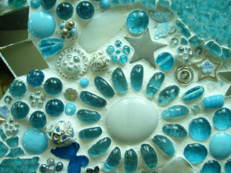
Turquoise is, generally thought to consist of 70% blue and 30% green. A blend of blue and green, shades of turquoise, have the same calming effects of those colors and shares the symbolism and characteristics of both colors. Aqua, aquamarine, beryl, blue-green, cerulean, teal and ultramarine are all names for turquoise colors.
Turquoise is much more than another color from the gemstone lineup. Its many shades, hues and tones combine to paint a world of joyousness and glee. Just like the gemstone, the color is deeply ingrained in human history as one that brings peace, harmony and lasting happiness. Native Indians believed that this fallen sky stone had an ability to ward off evil and offer health. Similarly the color has been embraced by cultures across the world as one that energizes interiors while providing pleasure and serenity.
This in-between color represents water, thus the names aqua and aquamarine. Like still water, it projects peace and tranquility. It is an open and friendly color that offers balance and stability. Turquoise is linked to emotional balance and serenity.
The positive connotations connected with turquoise color are sophistication, healing, protection and spirituality. The negative connotations are envy and—from a design standpoint with the light bright shades—femininity.
The color turquoise undoubtedly takes its name from the valuable and popular mineral of the same name often used in jewelry. Turquoise is closely associated with the Middle East and the American Southwest. jewelry. Turquoise is closely associated with the Middle East and the American Southwest.
From the mosaics of the ancient world, the aqua clay paint accents of Northwest Native American works to the rather kitchy “modern ” of the fifties, such as cone shaped plastic chairs , and lava lamps, these shades have been used in a startling range of ways.
Turquoise is equally popular with men and women. Although the dark shades of turquoise are perceived to be masculine, you can create feminine appeal in your design with the light shades of turquoise.
Some shades of turquoise have a ’50s or ’60s retro feel. Teal has a darker, somewhat more sophisticated look. Like the mineral, turquoise shades range from almost sky blue to deep greenish blues.
Keep the soft, feminine qualities going in a design by combining turquoise with lavender or pale pink. Bright turquoise and pink create a sparkly clean, retro look.
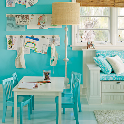
Make it art deco by pairing turquoise with white and black. Turquoise with gray or silver as well as terra cotta and light brown has an American Southwest flavor. Turquoise combined with orange or yellow creates a fresh, sporty look. The color is often used in tropical designs.
TURQUOISE COLOR SELECTIONS
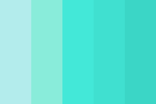 If your graphic design project is headed for print, use the CMYK formulations for the turquoise color you choose or specify a spot color. If your project will be viewed onscreen, use the RGB values. Use Hex codes if you work with websites. Turquoise colors include:
- Pale Turquoise: Hex #aeeeee | RGB 174,238,238 | CMYK 27,0,0,7
- Turquoise: Hex #00c5cd | RGB 0,197,205 | CMYK 100,4,0,20
- Bright Turquoise: Hex #00e5ee | RGB 0,229,238 | CMYK 100,4,0,7
- Medium Turquoise: Hex # | RGB 72,209,204 | CMYK 66,0,2,18
- Aquamarine: Hex #7fffd4 | RGB 127,255,212 | CMYK 50,0,17,0
Note: This post was compiled by Shirley Twofeathers for Color Therapy, you may repost and share without karmic repercussions, but only if you give me credit and a link back to this website. Bright Blessings.
Using The Color Violet
Look at us, said the violets blooming at her feet, all last winter we slept in the seeming death but at the right time God awakened us, and here we are to comfort you. ~Edward Payson Rod
 Wearing Violet:
Violet is often worn by people predisposed toward psychic matters, and is the perfect symbol of the “higher” mind, combining as it does the earthy, fieriness of red with the cool reasonableness of blue to forge an entirely different hue.
Absolutely wear violet when:
- You wish to make positive changes in your life and when you are looking for a purpose
- When you wish to feel special and unique and show other people that you are a non-conformist
- When you want to eliminate anger, destructive attitudes and addictions
Do not wear violet under the following conditions:
- If you suffer from depressive disorders
- If you are absent-minded and daydreaming
- If you feel stuck in any kind of grief
An Overdose of Violet:
Excess violet may be overpowering and suppress inner feelings and emotions, especially anger. It may also cause a sense of disquiet. You should always balance it with yellow!
Put some violet in your life when:
- You wish to re-balance your life
- There is a need to speed up the natural healing of the body.
- You have a desire to use your imagination to its fullest, and apply that imagination in practical ways.
- You wish to integrate new skills into every day life.
- There is a desire to remove obstacles.
- You have a need to calm over activity.
Questions to ask yourself when drawn to violet:
- Is there a need for self healing?
- What are you sacrificing to appear as a “good” or “helpful” person?
Ways to use violet:
- Violet is a great color to use in rooms where you practice relaxation and meditation techniques, as well as in spaces intended for introspective and contemplative thinking such as studios, libraries, bedrooms, verandas, and gardens.
- Violet stimulates blood flow to the brain, and it can be used to enhance intuition, imagination and creativity. When creating and composing his operas, Richard Wagner surrounded himself with this amazing color.
- Violet can be also very helpful for those suffering from insomnia or stress. Adorning your home with flowers like violets, lavender, lilacs, and orchids, or wearing gems such as amethyst, purple fluorite, sugulite, lepidolite, and charoite, will help you eliminate worries and doubts, and achieve inner balance and mental peace.
- Violet is also used to alleviate migraines. Crystal healers suggest placing an amethyst on the center of the forehead to relieve pain.
- Violet is also a good appetite suppressant. Eating more violet foods such as eggplants, purple cabbage, grapes, blueberries, and blackberries, will help you relax and keep hunger at bay.
- Wearing violet clothes or violet night gowns will help you become more calm, intuitive, creative and contemplative!
Loving violet:
Not loving violet:
Note: This post was compiled by Shirley Twofeathers for Color Therapy, you may repost and share without karmic repercussions, but only if you give me credit and a link back to this website. Blessed be.
Color Matters More Than You Realize
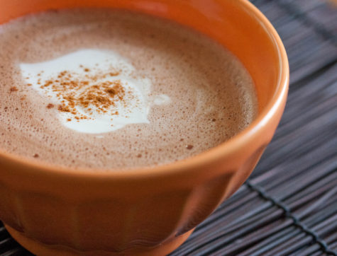
Before snuggling up to a warm fire with a hot cup of cocoa this winter, you may want to take a second look at the cup holding the chocolate. The warm beverage may taste more flavorful in an orange cup or cream-colored cup, a new study suggests.
The results add to past work showing how factors that have nothing to do with food preparation can affect the taste of food.
“The color of the container where food and drink are served can enhance some attributes like taste and aroma,” said study co-author Betina Piqueras-Fiszman, a researcher at the Universitat Politècnica de València in Spain and the University of Oxford in the United Kingdom, in a statement.
In general, how people perceive taste is influenced by many factors unrelated to the actual food. Past studies have shown that the color of the plate, the price on a bottle of wine, and the verbal description of food can affect people’s enjoyment of dishes and drinks alike.
To see how hot chocolate enjoyment was affected by cup color, Piqueras-Fiszman and her colleagues asked 57 participants to rate samples of the same delicious beverage in four colors of plastic cup: white, cream, orange and red. (All cups were white on the inside.)
The participants said the drink was more flavorful when served in a cream- or orange-colored cup. Interestingly, participants rated the orange- and cream-colored cups of cocoa tastier despite the fact that participants didn’t say there were any significant differences in sweetness or aroma between the colored cups.
The new results may help restaurant owners and Martha Stewart types serve cocoa in a cup that maximizes the enjoyment of the hot drink.
The findings were published in the October issue of the Journal of Sensory Studies.
Red On Women Drives Men Wild
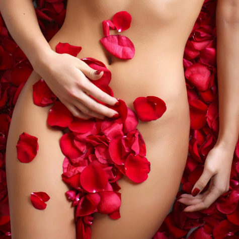
Red may be the color of love for a reason: It makes men feel more amorous towards women, a new study reports.
From ancient rituals to those red paper lace hearts on Valentines, red has been tied to carnal passions and romance in many cultures over the course of history.
In five psychological experiments, University of Rochester psychologists tested how different colors affected men’s attitudes towards women.
In one experiment, test subjects were shown a picture of a woman that was framed by either a red or white border and asked to answer a series of questions, such as: “How pretty do you think this person is?” Other experiments contrasted red with gray, green or blue (keeping saturation and brightness levels the same between the different hues).
In the final study, the shirt of the woman in the photo was digitally colored red or blue. In this experiment, men were questioned not only about their attraction to the woman, but about how they would plan a hypothetical date with her. For example, one question asked: “Imagine that you are going on a date with this person and have $100 in your wallet. How much would you be willing to spend on your date?”
In all the experiments, women shown framed by or wearing red were rated significantly more attractive and sexually desirable by men than the exact same women shown with other colors.
When wearing red, women were also more likely to be treated to a more expensive outing.
“It’s fascinating to find that something as ubiquitous as color can be having an effect on our behavior without our awareness,” said study team member Andrew Elliot.
The study, detailed in the Oct. 28 online edition of the Journal of Personality and Social Psychology, is said to be the first to scientifically document the effects of color on behavior in relationships.
Elliot and his co-author Daniela Niesta said the effect could be due to societal conditioning, though they attribute it to deeper biological roots because nonhuman male primates, such as baboons and chimpanzees, are known to be attracted to females displaying red.
The red effect applied only to males and only to their perceptions of attractiveness; it did not change their ratings of the pictured women in terms of likability, intelligence or kindness.
Other research suggests that the effect of color depends on the context. In a previous study, Elliot and his colleagues showed that seeing red in competitive situations, such as sporting events, leads to worse performance. Another recent study suggests that referees favor red-clad competitors because of a subconscious bias for the color.
Using Green
He had that curious love of green, which in individuals is always the sign of a subtle artistic temperament, and in nations is said to denote a laxity, if not a decadence of morals. ~ Oscar Wilde
Put green in your life when there is:
- A feeling of restriction caused by circumstances such as being housebound or confined.
- A need to let change happen, but also a fear of the unknown.
- A feeling of being trapped by other people’s rules and regulations and a need to break rigid patterns.
- A need for new ideas.
- A need for a new state of balance.
- A problem with personal relationships, especially with over-dominance and subservience.
- Green balances the emotions, calms, soothes nervous exhaustion, (use in moderation).
- Feng Shui claims that green eases absent-mindedness, nervousness and rudeness.
Loving green:
Green is a nice-person color, a “do-gooder, be-gooder” kind of color. This person has a warm heart. Passion is probably in there somewhere, buried under integrity and honor. If you love green, you put the greater good before your own good – try a little selfish behavior once in a while.
Green brings peace, rest, hope, comfort and nurturing, calmness and harmony. Interest in nature, plants, fellowmen, children and animals, health and healing, natural and plain life. Longing for a safe home and family-life. A dislike
of conflicts.
Not loving green:
A person who has an aversion to green may be more interested in independence and self-development than in a warm family-life. May prefer to keep a certain distance in (sexual) relationships.
Wearing green:
Wear green when you want to overcome a sense of thwarted ambition. Green says growth – balance – harmony. It is a color of healthy relationships.
Questions to ask yourself when drawn to green:
- Is there a need for space to gain fresh perspective?
- What is restricting you?
- Is there a situation or circumstance that is limiting or stopping your growth?
Note: This post was compiled by Shirley Twofeathers for Color Therapy, you may repost and share without karmic repercussions, but only if you give me credit and a link back to this website. Blessed be.
Using The Color Yellow
You put a blob of yellow here, and another at the further edge of the canvas: straight away a rapport is established between them. Colour acts in the way that music does… ~Georges Braque

Wearing Yellow:
Wear yellow to present a cheery, uplifting effect. Use it around your office to help keep a clear your mind, and improve memory and decision making.
Put yellow in your life when there is:
- Confusion and indecision, poor memory.
- Fear and anxiety caused by unknown factors leading to nervous and digestive disorders.
- Nervous exhaustion, nervous breakdown, “burn out,” panic attacks, hot flashes.
- Poor memory, inability to concentrate or study.
- Tendency to SAD, or lethargy and depression in dull weather.
- Irritability, tension, restlessness, feelings of depression and inability to make decisions.
Questions to ask yourself when drawn to yellow:
- Is there a need to start thinking clearly?
- What are you afraid of?
Loving Yellow:
Watch out for self-centered, “me first” energy when someone prefers yellow to the rest of the rainbow. If yellow is your favorite color, temper your use of the word “I” when you’re interested in someone else. You can come across as too ego-centric otherwise. Now, if you’re dating someone whose favorite hue is yellow, make sure to jump in and share stories about yourself, since this person may not give you much room.
Yellow is the color of cheerfulness, curiosity, alternation, flexibility, progress, amusement, contact through traveling and communication, learning and practical knowledge. People of high intellect favor yellow. A person who loves yellow may have a feeling for writing and speaking.
Not loving yellow:
A person who has aversion to yellow may be emotionally disappointed and bitter. May have tendency to rationalize feelings, or to avoid the depth of life by often changing relationships, many superficial relationships and/or constant changing activities.
Note: This post was compiled by Shirley Twofeathers for Color Therapy, you may repost and share without karmic repercussions, but only if you give me credit and a link back to this website. Blessed be.

I think it's time to go shopping... maybe even buy some really cool stuff at my online shops!!