Practical Applications
Colors For Curses
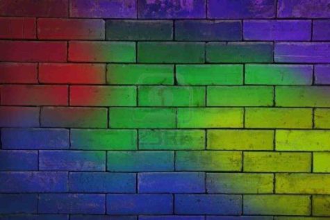
Here is a list of the five useful colors for dark magick. These can be used for candles, mojo bags, etc.
- Red: Hotfoot, Speed, Anger, Violence
- Black: General Curses, Death, Bad Luck
- Purple: Domination, Loss of Power, Addiction
- Yellow: Legal Troubles, Lose Favor, Illness in the Belly
- Green: Sickness, Loss of Money, Rot and Decay
Note: Curses, hexes, jinxes, and other negative spell work should not be undertaken lightly, and are not recommended as they have a tendency to blow back on the person casting the spell.
Source: Hoodoo Delish
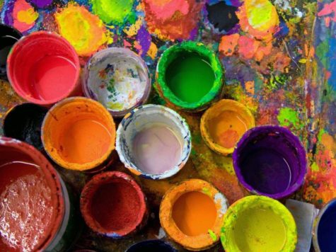
The Meaning of Colors
Here is a quick overview of the various colors and their meanings:
Red
Red is the color of fire and blood, so it is associated with energy, war, danger, strength, power, determination as well as passion, desire, and love. Red is a very emotionally intense color. It enhances human metabolism, increases respiration rate, and raises blood pressure.
- It has very high visibility that’s why stop signs, stoplights, and fire equipment are usually painted red.
- In heraldry, red is used to indicate courage. It is the color found in many national flags.
Orange
Orange combines the energy of red and the happiness of yellow. It is associated with joy, sunshine, and tropics. Orange represents enthusiasm, fascination, happiness, creativity, determination, attraction, success, encouragement, and stimulation.
- To the human eyes, orange is seen as a very hot color, so it gives the sensation of heat.
- Orange increases oxygen supply to the brain, produces an invigorating effect, and stimulates mental activity. It is highly accepted among young people.
- As a citrus color, orange is associated with healthy food and stimulates appetite.
- Orange is the color of fall and harvest.
- In heraldry, orange is symbolic of strength and endurance.
- Orange has very high visibility, so you can use it to catch attention and highlight the most important elements of your design.
- Orange is very effective for promoting food products and toys.
- Dark orange can mean deceit and distrust.
- Red-orange corresponds to desire, passion, pleasure, domination, aggression, and thirst for action.
Yellow
Yellow is the color of sunshine. It’s associated with joy, happiness, intellect, and energy. Yellow produces a warming effect, arouses cheerfulness, stimulates mental activity, and generates muscle energy.
- When overused, yellow may have a disturbing influence; it is known that babies cry more in yellow rooms.
- In heraldry, yellow indicates honor and loyalty. Later the meaning of yellow was connected with cowardice.
- Dull (dingy) yellow represents caution, decay, sickness, and jealousy.
- Light yellow is associated with intellect, freshness, and joy.
Green
Green is the color of nature. It symbolizes growth, harmony, freshness, and fertility.
- Sometimes green denotes lack of experience; for example, a ‘greenhorn’ is a novice.
- In heraldry, green indicates growth and hope.
- Dark green is associated with ambition, greed, and jealousy.
- Yellow-green can indicate sickness, cowardice, discord, and jealousy.
- Olive green is the traditional color of peace.
Blue
Blue is the color of the sky and sea. It is often associated with depth and stability. It symbolizes trust, loyalty, wisdom, confidence, intelligence, faith, truth, and heaven. Blue is considered beneficial to the mind and body. It slows human metabolism and produces a calming effect.
- Blue is strongly associated with tranquility and calmness.
- In heraldry, blue is used to symbolize piety and sincerity.
- You can use blue to promote products and services related to cleanliness (water purification filters, cleaning liquids), air and sky (airlines, airports, air conditioners), water and sea (sea voyages, mineral water).
- Blue is linked to consciousness and intellect.
- Blue is a masculine color; according to studies, it is highly accepted among males.
- Dark blue is associated with depth, expertise, and stability; it is a preferred color for corporate America.
- Avoid using blue when promoting food and cooking, because blue suppresses appetite.
- When used together with warm colors like yellow or red, blue can create high-impact, vibrant designs; for example, blue-yellow-red is a perfect color scheme for a superhero.
- Light blue is associated with health, healing, tranquility, understanding, and softness.
- Dark blue represents knowledge, power, integrity, and seriousness.
Purple
Purple combines the stability of blue and the energy of red. Purple is associated with royalty. It symbolizes power, nobility, luxury, and ambition.
- It conveys wealth and extravagance.
- Purple is associated with wisdom, dignity, independence, creativity, mystery, and magic.
- Almost 75 percent children prefer purple to all the other colors.
- Purple is a very rare color in nature; some people consider it to be artificial.
- Light purple evokes romantic and nostalgic feelings.
- Dark purple evokes gloom and sad feelings. It can cause frustration.
White
White is associated with light, goodness, innocence, and purity. It is considered to be the color of perfection. White means safety, purity, and cleanliness. As opposed to black, white usually has a positive connotation.
- White can represent a successful beginning.
- In heraldry, white depicts faith and purity.
- In advertising, white is associated with coolness and cleanliness because it’s the color of snow.
- You can use white to suggest simplicity in high-tech products.
- White is an appropriate color for charitable organizations
- Angels are usually imagined wearing white clothes.
- White is associated with hospitals, doctors, and sterility, so you can use white to suggest safety when promoting medical products.
- White is often associated with low weight, low-fat food, and dairy products.
Black
Black is associated with power, elegance, formality, death, evil, and mystery. Black is a mysterious color associated with fear and the unknown (black holes).
- It usually has a negative connotation (blacklist, black humor, ‘black death’).
- Black denotes strength and authority; it is considered to be a very formal, elegant, and prestigious color (black tie, black Mercedes).
- In heraldry, black is the symbol of grief.
- Black gives the feeling of perspective and depth, but the black background diminishes readability.
- A black suit or dress can make you look thinner.
- When designing for a gallery of painting or photography, you can use a black or gray background to make other colors stand out.
- Black contrasts well with bright colors. Combined with red or orange – other very powerful colors – black gives a very aggressive color scheme.
Other Colors:
- Pink signifies romance, love, and friendship. It denotes feminine qualities and passiveness.
- Brown suggests stability and denotes masculine qualities.
- Gold evokes the feeling of prestige. The meaning of gold is illumination, wisdom, and wealth. Gold often symbolizes high quality.
- Aqua is associated with emotional healing and protection.
Submitted by Raetta Parker
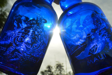
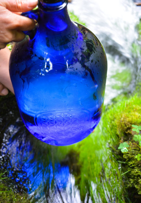
Blue Solar Water
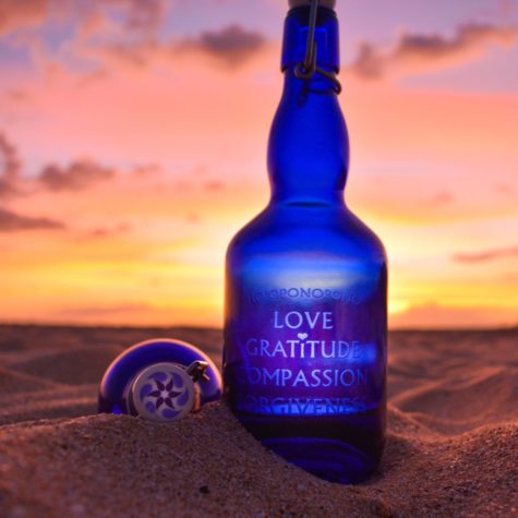
Blue Solar Water is easy to make, delicious to drink and is very a powerful tool for healing the body and spirit.
As we know, water carries vibrations, energy frequency, crystals, colors… Blue solar water provides the best: the powerful energy of the sun, the source of all life, and the fascinating properties of the healing and calming blue color. This water has become a favorite and popular after the book Zero Limits by Dr. Hew Len and above all through Ho’oponopono, an ancient Hawaiian healing technique.
In addition to being extremely healthy, this water helps cleanse the deep negative subconscious programs that we automatically repeat over and over again. Blue solar water heals emotional wounds and blockages, takes them to the surface and relieves us from them so that we get reset back to zero, in a pure state, to a clean start, without the background noise of negative thoughts. This water meets positivity, peace and love. And everyone can drink it, children, sick with cancer, especially those on chemotherapy. It is even tastier than plain water. And it is very easy to make.
Why blue?
Blue is the color of the fifth chakra, the so-called power center or the throat chakra (Vishuddha). The throat chakra is extremely important because it is the way through which energy from the higher energy centers can move to the lower ones and vice versa. It is the first center of higher frequencies and only when it is completely clean and open, we can reach higher states of consciousness. It is a bridge between the physical and the spiritual world, between the heart and the mind. It separates the secular from the sacred and transmitters the intention of the soul.
And it has been scientifically proven that the color blue has a tremendously powerful impact on our brains, decision-making and behavior.
Blue sky means a nice, relaxing day. Clean calm blue sea means calmness and serenity. In fact, everything blue symbolizes trust, loyalty, wisdom, confidence, intelligence, faith, truth, and heaven. Krishna is blue.
Science says it’s no coincidence these blue things make all of us us feel so good. After all, blue is the only color spectrum that can effectively prevent people from committing suicide.
It is proven that the color blue has a calming effect on people, and that is why it is used in different ways. In 2000, police in Glasgow, Scotland, installed blue lights in areas with a high crime rate. Since then, crime in those infamous neighborhoods decreased by 9%.
In Japan, several major railway companies switched to only blue lights at all railway crossings. To date they have a stunning success: In 2007, a year before the blue lights were installed, they had 640 suicides. In 2008, after the lights were installed, there were zero suicides!
If this is all strange and you do not believe in the incredible efficiency of blue, read on.
One theory says that the color itself has a tangible, biological effect on our brain chemistry. Harold Wohlfarth, president of the German Academy of Color Science, conducted a study in which he found that blue color lighting actually had a psychological impact on children and adults, and what is particularly bizarre in all things is the fact that it had the same effect even on blind people.
Wohlfarth believes that traces of electromagnetic energy from the blue light affects certain neurotransmitters in the brain. When light of a certain color falls on the eye, even if the eye is blind, it affects the gland that produces melatonin, which creates a chain reaction that elevates mood and calms emotions.
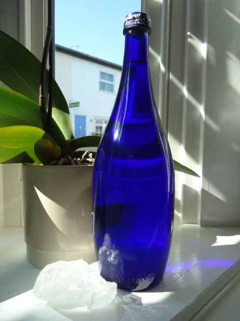
How to make Blue solar water?
All you need is a blue glass bottle (the shade of blue is not important) and fill it up with filtered, spring or plain tap water. You also need to make sure that the cap you seal the bottle with is not made of metal. It can be glass or plastic, but never use metal. The cap only serves as a protection against dust or insects that are very fond of this water.
This water bottle should be then kept on the sun for 1-12 hours. The longer you keep it on the sun, the sweeter its taste will get. But remember not to keep it longer than 12 hours.
How to drink it?
Drink this water as much as possible, it is very tasty and drinkable. Somehow, our body recognizes it, so even those who don’t drink so much water will have no problem drinking a few liters.
In addition to drinking it, you can use this water for cooking, watering flowers, for your animals, add it in the washing machine, dishwasher, put in a sprayer and refresh the rooms, add it to your bath…
Once you have made your Blue Solar Water you can transfer it into another container, plastic or glass, doesn’t matter. It can be kept in the refrigerator or at room temperature.
If you get really excited about the solar water, here are some other uses:
- Add some to your coffee, tea, cocoa, juice, etc
- Add Blue Solar Water to everything you cook, pasta, soup, oatmeal, scrambled eggs, etc.
- Add some Blue Solar Water to your washing machine when washing clothes
- Spray some in your dryer
- Add it to your radiator to make your car hummmm
- Add it to your bath water
- Spray yourself with Blue Solar water after showering
- Spray rooms with Blue Solar Water
- Gargle with it.
- Wash floors with it
- Wash your car with Blue Solar Water
From: Shift Frequency
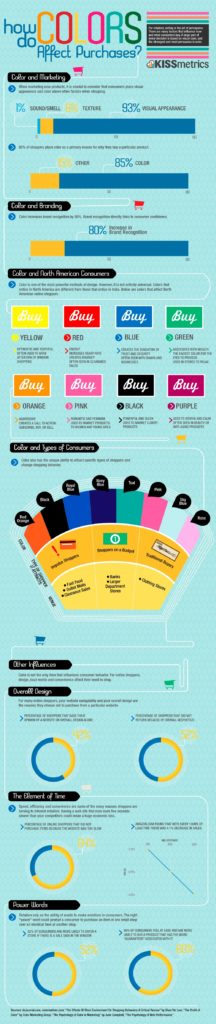
Marketing and Color
Here is a great infographic about how color affects purchasing, merchandising, and marketing.
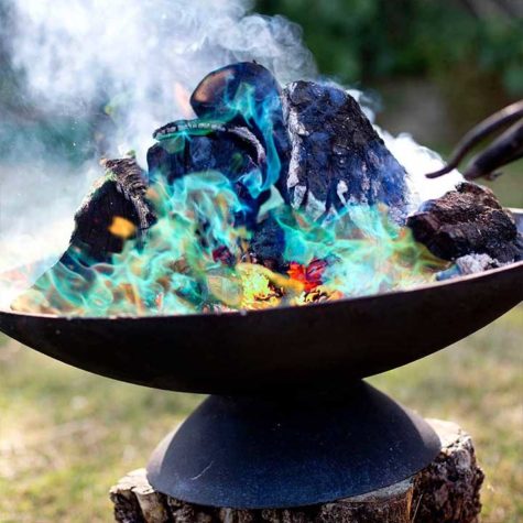
Making Colored Fire
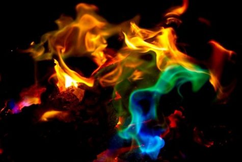
A campfire is magical. How the coals glow and the flames flicker and the sparks pop and shower, its mesmerizing. But, you can make it even more magical with these simple tricks. It will get old if you use these all the time, but an occasional surprise makes a campfire at that special place or time something to be remembered.
Chemicals
Adding a small amount of chemicals to a hot burning fire can have an ‘Ooooh-aaaah’ effect. It’s important to do these only after all cooking has been done on the fire and when there is little wind so the smoke can rise up rather than into campers’ faces.
You may acquire these chemicals in a grocery or dry goods store, in the laundry or cleaner section. Find copper sulfate in swimming pool supplies. Epsom salts, borax, and calcium chloride may be found with laundry/cleaning supplies.
Copper Chloride, Strontium Chloride, and others my be best found at fireworks supply companies. Practice before using them at a campfire so you know how much to use and how to best apply for maximum effect.

Creating Colors and Special Effects:
- Copper Chloride ~ BLUE flame
- Borax (laundry) ~ LIGHT GREEN flame
- Copper Sulfate (tree root killer for plumbers) ~ GREEN flame
- Strontium Chloride ~ RED flame
- Potassium Chloride (water softener salt) ~ PURPLE flame
- Calcium Chloride ~ BLUE flame
- Lithium Chloride ~ PINK flame
- Alum ~ GREEN flame
- Sodium Chloride (table salt) ~ ORANGE flame
- Magnesium Sulfate (Epsom salts) ~ WHITE flame
- Sugar ~ sprinkle into fire for TINY SPARKS
- Powdered Coffee Creamer ~ throw a handful into the flames above the fire for small SPARKLY FLASHES
- Flour ~ toss a small amount into flame to make a FLASH FLAME
- Iron filings ~ toss a small bit into flame to make GOLD SPARKS
- Powdered aluminum ~ toss a small bit into flame to make SILVER SPARKS
- Magnesium shavings ~ toss a small bit into flame to make very bright SILVER SPARKS
- VIOLET ~ 3 parts Potassium sulfate, 1 part Potassium nitrate (saltpeter)
So, then how do you get the chemicals into the fire? Well, throwing the powder in gives a burst of color, but then quickly dies out. You might want to do this for special effect when telling a story. But, to make the colors last longer, you can create wax patties. Don’t use these patties if you want sparks, just toss the dry chemical on.
How To Create Wax Patties
- Melt old candle wax in a double boiler.
- Get a bunch of small paper dixie cups.
- Pour about 1/4 inch of chemical into each cup.
- Pour melted wax into the cup to just cover the chemical and quickly stir it with an unfolded paperclip or other small stir rod. This is to thoroughly coat all the chemical.
Let thoroughly cool and then peel or cut off the sides of the paper cup. I leave the paper bottom on. Toss one of these patties into the hottest part of the fire and it will melt and the show begins!
Mixing different chemicals will not make a new color. Just add one single type at a time or put different kinds in different places.
From: Camp Fire Dude
Color Psychology: How to Make Your Home Feel Good
Ready to paint? A little color psychology may be just what you need to create soothing and productive moods.
Home decor is often viewed as simply a matter of aesthetics — what looks attractive. But proponents of color psychology believe that the colors you use to decorate your home can have a profound effect on the emotional well-being of you and your family.
“Color is a universal, nonverbal language, and we all intuitively know how to speak it,” says Leslie Harrington, a color consultant in Old Greenwich, Conn. and a noted expert on the use of color in residential and industrial decor. “What color you paint your walls isn’t just a matter of aesthetics. It’s a tool that can be leveraged to affect emotions and behavior.”
If you like the idea of using color to create an emotionally healthy home, color consultants say you should first consider the primary function of each room. Next, pick a predominant color. Although it can’t be proven scientifically, color consultants say some hues work better than others at encouraging certain activities. Need ideas? Here’s a room-by-room rundown of the colors believed to work best in each of the most important rooms of your home, and the moods they create.
Living room and foyer paint colors.
Warm tones like reds, yellows, and oranges, and earth tones like brown and beige often work well in both the living room and foyer, because they’re though to stimulate conversation. “These are colors that encourage people to sit around and talk,” says Kate Smith, a color consultant in Lorton, Va. “You feel the warmth, the connection with other people.”
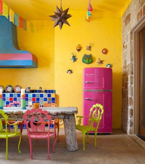
Kitchen paint colors.
Color consultants say that if you have fond memories of spending time in the kitchen when you were a kid, it might make sense to recreate the color scheme in your grown-up kitchen. “If you grew up in a blue-and-white kitchen and have great memories, blue and white may be the best colors for you and your family,” says Smith.
If there’s no particular paint scheme you remember fondly, reds and yellows can be great colors in the kitchen as well as in the living room and foyer. But watch out if you’re watching your weight: in addition to stimulating conversation, color consultants say that red may prompt you to eat more, if only subtly. “If you’re on a diet, you might want to keep red out of the kitchen,” Harrington says, adding that the restaurant industry has long recognized the appetite-stimulating power of red decor.
Dining room paint colors.
Because it’s stimulating, red decor can be great for a formal dining room. In addition to encouraging conversation, it whets the appetites of your guests. “If your dining room is red, people may think you are a better cook,” says Harrington.
Bedroom paint colors.
The bedroom is where you go to relax and reconnect with your partner. Cool colors — blues, greens and lavenders — can be great choices here, because they are thought to have a calming effect. The darker the hue, the more pronounced the effect is believed to be. “Reds tend to increase blood pressure and heart rate and stimulate activity,” says Harrington. “Blue does just the opposite. That’s why we think of it as calming.”
What if your teenager has a few ideas about how to paint his or her bedroom? In the name of family harmony, it probably makes sense to let your teen pick the paint — within reason. Harrington says she let her own daughter pick a wild paint scheme for her room — with the proviso that her daughter would repaint it white when she moved out.
Bathroom paint colors.
Whites and warm colors have always been popular choices for bathrooms, in large part because they connote cleanliness and purity. But nowadays the bathroom is used not just as a place to wash up, but also as a private retreat for relaxation and rejuvenation. Says Harrington: “Most people feel comfortable with blues and greens and turquoises because these colors give a sense of being clean and fresh — and calm.”
But spa colors in the bathroom make sense only if they flatter you. “When you look in the bathroom mirror, you want to look great,” says Smith. “If you would never wear a particular color, don’t paint your bathroom that color. That’s a recipe for disaster.”
Workout room paint colors.
“Reds and oranges can help you move,” says Harrington. “But they can also make you feel hot.” For this reason, blues and greens may be better choices here. Harrington says that yellow-greens and blue-greens may be the best choices because, in terms of color psychology, they’re “happier.”
Home office paint colors.
The name of the game here is productivity: the faster you complete work-related tasks, the more time you’ll have to spend enjoying family and friends. And color consultants agree that green can be a great choice for a home office. “Green is the color of concentration,” says Harrington. “It’s one of the best colors to be surrounded by for long periods of time.”
From: WebMD
Colorizing the Kitchen
Home decor is often viewed as simply a matter of aesthetics — what looks attractive. But proponents of color psychology believe that the colors you use to decorate your home can have a profound effect on the emotional well-being of you and your family.
“Color is a universal, nonverbal language, and we all intuitively know how to speak it,” says Leslie Harrington, a color consultant in Old Greenwich, Conn. and a noted expert on the use of color in residential and industrial decor. “What color you paint your walls isn’t just a matter of aesthetics. It’s a tool that can be leveraged to affect emotions and behavior.”
Color consultants say that if you have fond memories of spending time in the kitchen when you were a kid, it might make sense to recreate the color scheme in your grown-up kitchen. “If you grew up in a blue-and-white kitchen and have great memories, blue and white may be the best colors for you and your family,” says Smith.
If there’s no particular paint scheme you remember fondly, reds and yellows can be great colors in the kitchen as well as in the living room and foyer. But watch out if you’re watching your weight: in addition to stimulating conversation, color consultants say that red may prompt you to eat more, if only subtly. “If you’re on a diet, you might want to keep red out of the kitchen,” Harrington says, adding that the restaurant industry has long recognized the appetite-stimulating power of red decor.
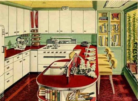
The Best Paint Colors for Every Type of Kitchen
Painting your kitchen walls is one of the quickest, and easiest ways to re-do a kitchen. Before you rush out and buy gallons of paint, think carefully about what your dream kitchen looks like. Experts agree that it’s not just the color on the walls that determine how a kitchen looks and feels. How the wall paint color relates to the cabinetry, countertops, tiles, molding, appliances, lighting and flooring is very important.
Before you buy paint, test sample swatches on your walls and observe how the colors look at various times during the day and evening. Bring all your color influencers into the room so you can see how the paint looks with all the various elements.
Paint Color Basics
- Tip #1: Colors can change
Keep in mind that natural sunlight in the kitchen will change in intensity throughout the day. Morning light appears differently than evening light, and shadows can affect the color perception. Color is essentially light – how we perceive a color depends greatly on how light is reflecting off of that color. There is a term used to describe this color-changing experience: illuminant metameric failure. It simply means that two colors may look similar in one light condition but might not match in another. So understanding the light patterns in your kitchen, and knowing what other colors will be going into the kitchen, is incredibly important.
- Tip #2: Select your paint color at home
Don’t choose a paint color while standing in the paint store aisle. Bring home actual paint samples (many brands offer small sample jars) that you can apply to your walls. Paint these swatches next to cabinetry, flooring, countertops and any fabrics you plan on using in the space. Observe how the paint changes during the day and notice if any of your other kitchen materials are affected by light hitting the paint and reflecting onto the surface. For example, a strong red wall color may, at certain times of the day, reflect a pink hue onto white cabinetry or flooring.
- Tip #3: Warm colors work
There’s a reason we see a lot of warm, earthy tones in the kitchen. Kitchens harken back the days of open fires and slow roasted foods. Studies have shown that our appetites increase when we see red or orange colors. Although warm hues may be a popular choice for kitchens, it doesn’t mean you have to ignore blues and greens. Pair cool tones with warm neutrals like a warm gray or warm orange. You’ll be surprised how mixing the palette can create the kitchen of your dreams.
- Tip #4: Paint isn’t just for walls
Don’t forget that paint can be used on a variety of kitchen elements: cabinets, tables, chairs and other decorative objects. If your favorite paint color won’t work on the walls, try using it on a piece of furniture instead. Vintage pieces or new pieces can be painted (or spray painted). Test the underside or backside first to make sure you’ve selected the right type of paint for your project.
Best Colors For:
- Northern Exposure:
Northern light is cool, indirect, and even in appearance, making it the preferred light of artists and painters. Light from northern exposure won’t shift as much throughout the day, so expect a more even color tone in the room. The cooler sunrays will enhance cooler colors like blues and greens. Even cool tones of white will look good in northern light.
- Southern Exposure:
Southern light is stronger, more direct and tends to shift throughout the day. This might make your paint colors look very different at different times. You might notice that the strong sunlight makes paint colors reflect onto nearby surfaces. Kitchens with a southern exposure can do well with all walls being painted with the same color but keep in mind that during the day, each wall might appear to be a different shade. As the warm light will draw out warmth in the color, choose earthy colors.
- Eastern Exposure:
An eastern exposure kitchen will have strong sunlight first thing in the morning and lots of shade in the afternoon. Expect shadowing throughout the day as the sun moves across the sky. You can play up the effect of the sun by having a kitchen with contrasting colors. Think light cabinets and darker walls.
- Western Exposure:
Kitchens facing west will have strong sunlight in the afternoon and into the early evening. Dark colors will help absorb excessive light (and heat). Combine strong cabinet colors with a lighter tone like Ivory Brown. Light cabinets might do well with an offset color.
- No Windows:
A windowless kitchen will need to rely on artificial light. The best kitchen will have a combination of task lighting, overhead light and ambient light and the types of bulbs you use will greatly influence the type of light. Incandescent and halogen bulbs cast warmer, more yellow, tones. These bulbs will bring out warmer hues and cast a warm glow in the room. Fluorescent or cooler bulbs will cast a blue or green hue into the space. Try a neutral blue.
- Tiny Kitchen:
You don’t have to steer away from dark colors in a small kitchen. In fact, having a mix of contrasting colors can help the kitchen feel larger. Depending on your cabinet color, a strong paint like Rapture (4001-6B) has enough blue and red, as well as gray, to make it work with a variety of other colors. Adding rows of shelving and utilizing the kitchen’s vertical space can help break up the paint while maximizing storage.
- Open Floor Plan:
Open kitchens, with nearby dining rooms or family rooms, will need to be color-conscious when it comes to walls. Not only will your paint color need to match the kitchen elements, you’ll want to make sure that it coordinates with the other rooms as well. When selecting a color, try a gray-infused neutral that will go with a variety of color palettes.
- Lots Of Wood Cabinets:
If you have a lot of wood cabinetry in your kitchen you’ll want to be smart about your color selection. Do you want the cabinetry to disappear? Try a paint color that is a shade or two lighter than the cabinets. Do you want to compliment the wood and show it off? Find a paint color from a different palette that has complimentary tones.
- Outdated Countertops:
If all you can afford to do is repaint your walls, don’t worry. Paint can help downplay or distract from any unattractive features in the kitchen. Colors that dominate, or play up your favorite color, will do well. Consider painting three of the walls the same color as the cabinets (to hide them) and use the fourth wall as a strong accent color.
- Stainless Steel Appliances:
Stainless steel appliances have a cool, but gray, appearance, making them a good neutral for the kitchen. However, kitchens with too much stainless steel in the kitchen run the risk of looking cold and utilitarian. Offset the cold by introducing a warm color.
- Black Appliances:
Black appliances, like stainless steel, can look cold and dark. In some kitchens they may appear like black holes within the space. So balancing these strong elements is key for the kitchen. Depending upon the cabinet colors, a warm brown can create a sophisticated look next to black.
- If You Rent:
The best reason for using a neutral paint color on the wall of a rental is that it will be much easier to paint over once you move out. But neutrals don’t have to be boring. If you prefer cool tones, a gray-blue color will work with nearly any color scheme. Warm neutrals will also work well.
- If You Have A Dark Backsplash:
Do you want your backsplash to stand out or disappear? If you want it to stand out, then choose a much lighter color. Some black backsplashes can pair well with similar dark colors.
- If You Have A Light Backsplash:
Light backsplashes, like white or cream, can work well with a variety of paint colors. A bright chalk white will really show off the veining in white marble, for example. Sophisticated grays can also be a great compliment to light colors. Be careful about really dark colors next to white – the color may reflect onto the surface and change the color to one you don’t want.
- If Your Kitchen Also Functions As An Entryway:
If your kitchen serves as the main entry to the home, you’ll want to be less conscious of the color and more aware of the type of paint you use. Be sure you select a paint designed for heavy traffic and can easily wipe down, like a semi-gloss finish. Texture is important too. A smooth wall will show marks faster than a more textured one.
Borrowed from: The Prosperity Project
Best colors for a closet
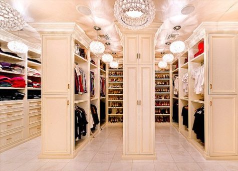
You may not give much thought to the inside of your closets when painting a room but paint pros say that choosing the right color and sheen will not only improve the appearance of your closet but yours as well. No more reaching into a dark closet and grabbing the navy blouse instead of the black one. Debbie Zimmer of the Paint Quality Institute has some pointers on what to consider when painting a closet.
- An open closet.
Your best bet with a closet or storage space that’s open to the rest of the room is to paint it the same color as the room or a slightly lighter shade. That way it’s more integrated and less likely to draw attention to what’s inside.
- Your primary closet.
You’ll want the closet where you store your wardrobe to be bright so you can actually see the color of your clothing. White or a light color are good choices. Choose a paint with a shinier sheen such as semi-gloss, which will reflect more light.
- Pantry or bathroom closets.
Use a durable paint in your pantry and other closets where you store things that may spill or get sticky. Use a semi-gloss sheen that stands up to scrubbing. As for color, choose one that blends in with the room.
- Your junk closet.
For those catch-all closets where you stash off-season sporting goods, boots, cleaning supplies, or other gear, think about a darker color that de-emphasizes what’s inside. And keep the door closed
- Guest room closet.
You can be more playful with a closet in a guest room that’s used infrequently. Try a contrasting color. That way when your guests open the door they get a pop of color. Zimmer says that darker colors are more forgiving and can make dust less noticeable.
DESIGN TIP:
Interior designers recommend that you keep the color in your closet subtle and neutral. There really is no need to put substantial color in this room. Here’s why:
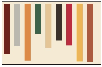
This graphic represents a neutral closet. The background is an off white or beige and the rectangles are your clothes. We all have just about every color from lights to darks in our closets so having the background a neutral will visually make the closet more appealing and easier to see. It’s really a small detail that will make a large impact in your closet.
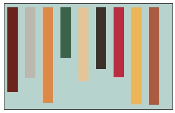
Now this closet was painted the same coastal blue that’s been trending for quite some time. So many people have this color in their bedroom and have taken it into their closet but look what happens. It’s very unsettling to see all this color in a closet. The color of your clothes fight with the blue and it just becomes a mess. It’s like painting every room in your home a different and unrelated color. It doesn’t make sense and it’s just ugly! By the way – the color of the “clothes” are the same in both these graphics but see how different they look?
According to Feng Shui principles, white is the ideal color as it opens the energy more, as well as brings the crisp quality of the metal feng shui element.
So, I was thinking about red or maybe orange… I did some experimenting with the graphic, even made one a bright white. Here’s a sampling of the different colors:


Wow… I really like the black! I wonder if I could make it work in real life, or if it just looks good because it’s on a digital graphic instead of on a wall.
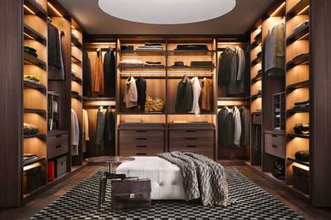
So my friends, whether you have a very large walk in closet or a very small closet, take the time out to finish it. And remember, color matters!
Borrowed from: The Prosperity Project
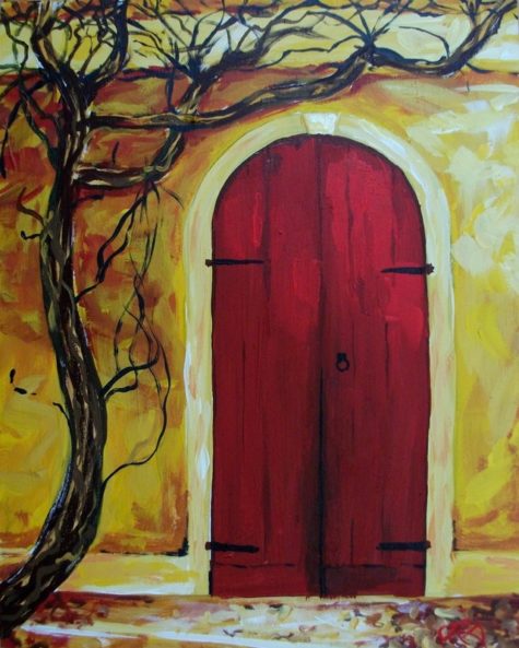
Colorizing Your Front Door
In feng shui, the front door is considered the called the mouth of Chi. It is through the front door that the house receives its feng shui nourishment of energy. The quality of this energy determines the quality of energy in your home. In classical feng shui, the choice of most auspicious color is based on the direction of the front door and its corresponding feng shui element.
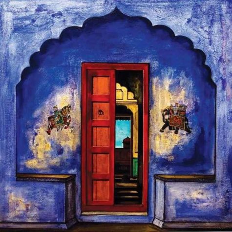
Feng shui is all about good energy, and you can welcome this energy with a strong, auspicious feng shui front door. Because it is through the front door that the house absorbs most of the energy it needs in order to nourish your personal energy, it is important to do your best in creating a strong feng shui front door.
The easiest way to do that is to find the appropriate feng shui design for your door – be it with colors, shapes, images or materials. The best feng shui design is the one that nourishes the feng shui element that corresponds to the direction your front door is facing.
East
The feng shui element of the east is wood, so if your front door is facing east, your best choices are the wood element colors green and brown.
The Wood feng shui element is nourished by the Water feng shui element and supported by the Earth feng shui element, so you can also choose the colors of these two elements.
To sum it up for you, best feng shui colors for an East facing front door are (in order of their auspiciousness): green, brown, blue, black, very light yellow and all earthy colors.
Avoid the following colors for your East facing front door: red, purple, white and gray. These colors represent the element of Fire and Metal that are destructive to Wood.
Southeast
The color choices for your southeast front door are similar to an east facing door because they share the same feng shui element. The feng shui element of the Southeast direction is the Wood element, and the corresponding feng shui bagua energy is Money and Abundance.
In case of a Southeast facing front door, you have additional color choices because there are two more elements that bring good energy to this area. These two elements – the Water and the Earth feng shui elements – are both nourishing and supportive of Wood, so you can use their colors, too, for your Southeast facing front door
Because a Southeast facing door is considered a prosperity door in feng shui, often the best color and design choices are those corresponding to the Water feng shui element, as water is the universal symbol of prosperity flow and abundance.
To sum it up, the best feng shui colors for a Southeast facing front door are (in order of their auspiciousness): green, blue, brown, black, very light yellow and all earthy colors.
Avoid the following colors for your Southeast facing front door: red, purple, white and gray. These colors represent the elements of Fire and Metal that are destructive to Wood.
South
South is the only direction with the fire feng shui element, so the best feng shui color for a South facing front door is the red, of course! Other feng shui fire element colors that are good for your South door are yellow, purple, orange and strong pink/magenta. As some of these colors might not work with your house exterior, here are a couple other color choices.
The element of Wood is nourishing for the Fire element/creates it, thus the Wood element colors are also good for a South-facing front door.
To sum it up for you, best feng shui colors for a South facing front door are (in order of their auspiciousness): red, purple, strong yellow, deep orange, deep pink, green and brown colors.
Avoid the following colors for your South facing front door: blue, black and all earthy colors. These colors represent the elements of Water and Earth that are destructive/weakening for the Fire element of South.
Southwest
The feng shui energy associated with a southwest door is maternal energy, as well as the energy of love and marriage. Because of this, you should choose a color of the Earth element or go for a color of a feng shui element that nourishes Earth.
In case of a Southwest facing front door, there is one more feng shui element that you can use for an additional choice of colors. The element of Fire is nourishing for the Earth element/creates it, thus the Fire element colors are also good for a Southwest facing front door.
So, the best feng shui colors for a Southwest facing front door are (in order of their auspiciousness): earthy/sandy colors, yellow, burgundy red, purple, deep orange, and rich pink.
Avoid the following colors for your Southwest facing front door: green, brown, white, gray, blue and black. These colors represent the elements of Wood, Metal and Water that are destructive/weakening for the Earth element of the Southwest bagua area.
West
For a western facing door go for the colors of the metal feng shui element, which are white and gray. If they’re a little bland for your tastes, you can also go back to Earth element color choices for your western facing front door.
In the case of a West facing front door, there is one more feng shui element you can use; this gives you a wider range of good colors. The element of Earth is nourishing for the Metal element, thus all Earth element colors are also good for a West facing front door.
So, the best feng shui colors for a West facing front door are (in order of their auspiciousness): white, gray, light yellow and all earthy/sandy colors.
Avoid the following colors for your West facing front door: blue, black, red, purple, orange, and deep pink. These colors represent the elements of Water and Fire that are weakening/destructive for the Metal element of West direction.
Northwest
A northwest front door has the same best color choices as the western facing door because both directions share the same feng shui element of metal. However, because in feng shui the northwest direction is associated with helpful people, you might need to pay extra attention to it.
In the case of a Northwest facing front door, you can also use the colors of the Earth feng shui element, as this element is nourishing/creates the Metal element.
So, the best feng shui colors for a Northwest facing front door are (in order of their auspiciousness): white, gray, light yellow and all earthy/sandy colors.
Avoid These Colors for Your Northwest Facing Front Door: blue, black, red, purple, orange, and deep pink. These colors represent the elements of Water and Fire that are weakening/destructive for the Metal element of Northwest direction.
North
North is the only direction of the feng shui element of water, so the best choices for a north facing door are the water element colors, black and blue. If these two colors do not work well with your house exterior, you can go for metal element colors.
In case of a North facing front door, there is one more feng shui element that you can use for an additional choice of colors. The element of Metal is nourishing for the Water element/creates it, thus Metal element colors are also good for a North facing front door.
So, the best feng shui colors for a North facing front door are (in order of their auspiciousness): blue, black, white and gray.
Avoid the following colors for your North facing front door: green, brown, yellow, red, purple, orange, and deep pink. These colors represent the elements of Wood, Earth and Fire that are weakening/destructive for the Water element of North direction.
Northeast
A northeast facing front door is an opening to the energy of spiritual growth and cultivation. Its feng shui element is Earth. When you have a Northeast facing front door, there is one more feng shui element that you can use as an additional choice of color.
The feng shui element of Fire is nourishing for the Earth element because it creates it, thus the Fire element colors are also good for a Northeast facing front door.
So, the best feng shui colors for a Northeast facing front door are (in order of their auspiciousness): earthy/sandy colors, yellow, burgundy red, purple, deep orange, and rich pink.
Avoid the following colors for your Northeast facing front door: green, brown, white, gray, blue and black. These colors represent the feng shui elements of Wood, Metal and Water that are destructive/weakening for the Earth element of the Northeast area.
Borrowed from: The Prosperity Project
How Blue LEDs Affect Sleep
Fluorescent bulbs and light-emitting diodes (LEDs) have taken over lighting because they are more energy efficient and can provide better lighting than incandescent bulbs. They are found in everything from task lighting to televisions to smartphones. But while these bulbs are helpful in many ways, they can also have a negative effect on sleep.
The problem with artificial light
All artificial light, including LEDs, fluorescent bulbs and incandescent bulbs, can interrupt normal sleep patterns. The body’s biological clock works in rhythms that are set by the amount of light and dark the body is exposed to. This is called the circadian rhythm. Circadian rhythms control the timing of many physiological processes. They determine sleeping and feeding patterns, as well as brain activity, hormone production and cell regeneration.
When the body is exposed to only to the natural light of the sun, the hypothalamus area of the brain sets its sleep patterns according to when it is light outside and to when it is dark. Light is detected by the retina, which sends signals to the hypothalamus. When it starts getting dark outside, the hypothalamus signals to the body to start creating sleep hormones, like melatonin, and to drop the human’s body temperature to prepare for sleep, according to the National Sleep Foundation. In the morning, when light is sensed, the body is told to warm up and to produce hormones, like cortisol, that wake the body up.
When artificial light is added to a human’s day, the body’s natural rhythms become confused. The retina can now receive light no matter what time of day it is, so the body doesn’t know when to get ready for sleep. A study published in the Endocrine Society’s Journal of Clinical Endocrinology & Metabolism found that, when compared with dim light, exposure to room light during the night suppressed melatonin by around 85 percent in trials.
Blue light and sleep patterns
Fluorescent and LEDs bulbs create a two-fold problem when it comes to sleep. First, they produce artificial light. Second, they produce blue light.
Blue light wavelengths produced by electronics and overhead lights boost attention, reaction times and mood, according to Harvard Medical School. This can be great for the daytime when the body needs to be alert, but at night it can become a problem.
Research has found that exposure to blue light suppresses the production of melatonin more than any other type of light. It is believed that the shorter wavelengths in blue light is what causes the body to produce less melatonin because the body is more sensitive to this type of light.
“In terms of light and our brains, there is a spectrum of wavelengths that impacts the human circadian system,” said David Earnest, a professor and circadian rhythms expert at the Texas A&M Health Science Center College of Medicine. “Blue light is the most sensitive side of the spectrum.”
A study by the University of Toronto found that those who wore glasses that blocked blue light wavelengths produced more melatonin than those who didn’t during night shifts. Other studies have found that blue wavelengths suppress delta brainwaves, which induce sleep, and boost alpha wavelengths, which create alertness.
Solutions to blue light sleep problems
To get better sleep, it would be best to stop using artificial light altogether, but that isn’t possible in modern times. There are some more reasonable solutions, though.
“To prevent sleeping problems, avoid any exposure to blue light 30 to 60 minutes prior to bed. That means, no TV, tablets, computers or smart phones,” said Dr. Robert Oexman, director of the Sleep to Live Institute. “Ideally, you want your environment to be dimly lit so your body can start naturally producing melatonin.”
Andrew Simon, a naturopathic physician at the Bastyr Center for Natural Health, also suggested changing all overhead lights to full spectrum if possible, and to use some of the new smart home tech solutions to have lights turn off gradually or at a certain time, to help encourage the body’s natural sleep/wake cycle.
If these steps aren’t possible, dimming devices and wearing blue light filtering glasses can help.
Source: Live Science
I think it's time to go shopping... maybe even buy some really cool stuff at my online shops!!